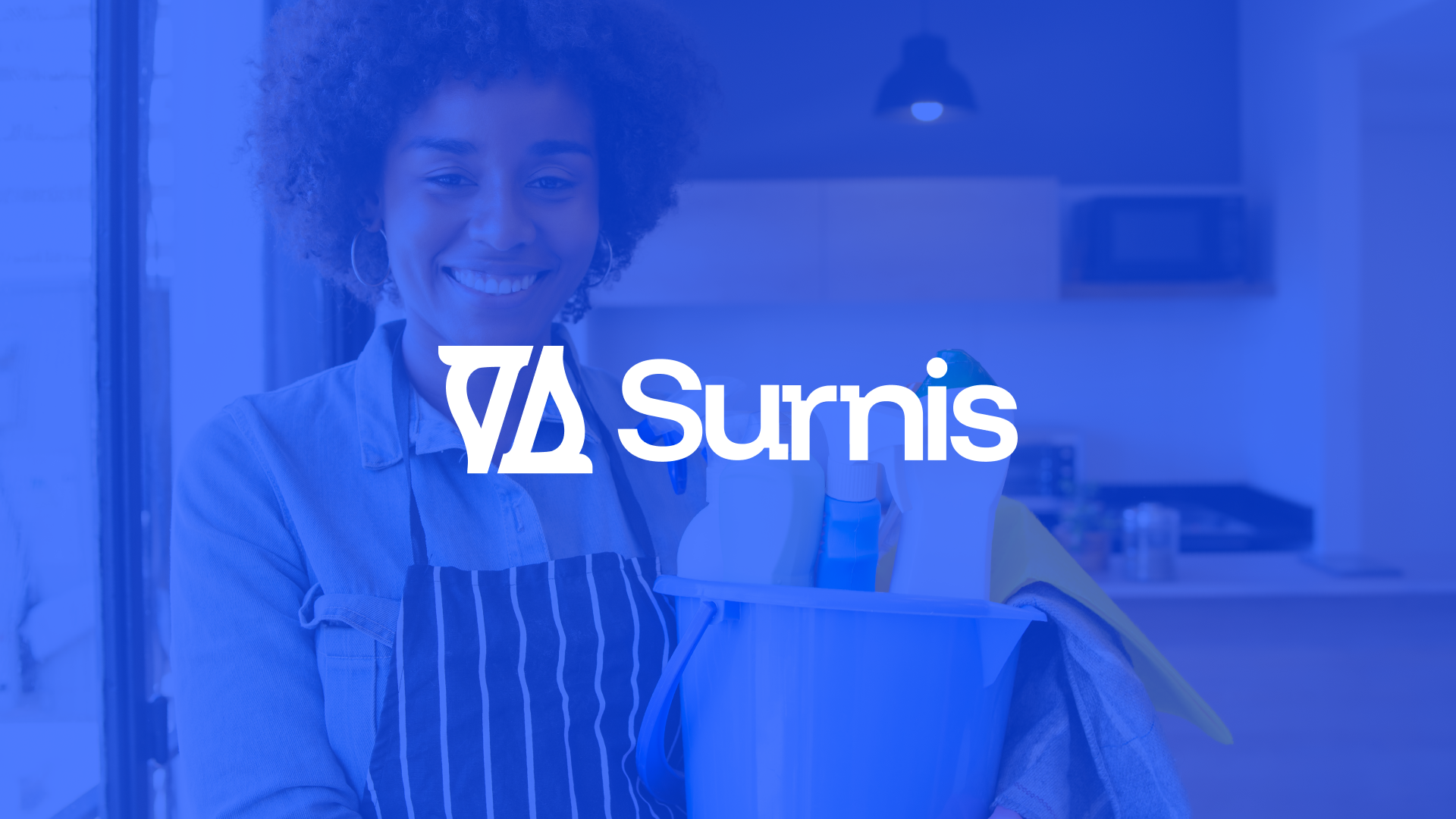
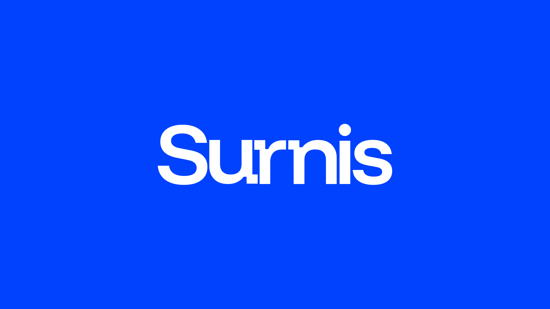
Surnis
A clean, contemporary visual identity system designed to make deep cleaning and space maintenance feel refined, dependable, and lifestyle-led.
// Challenge
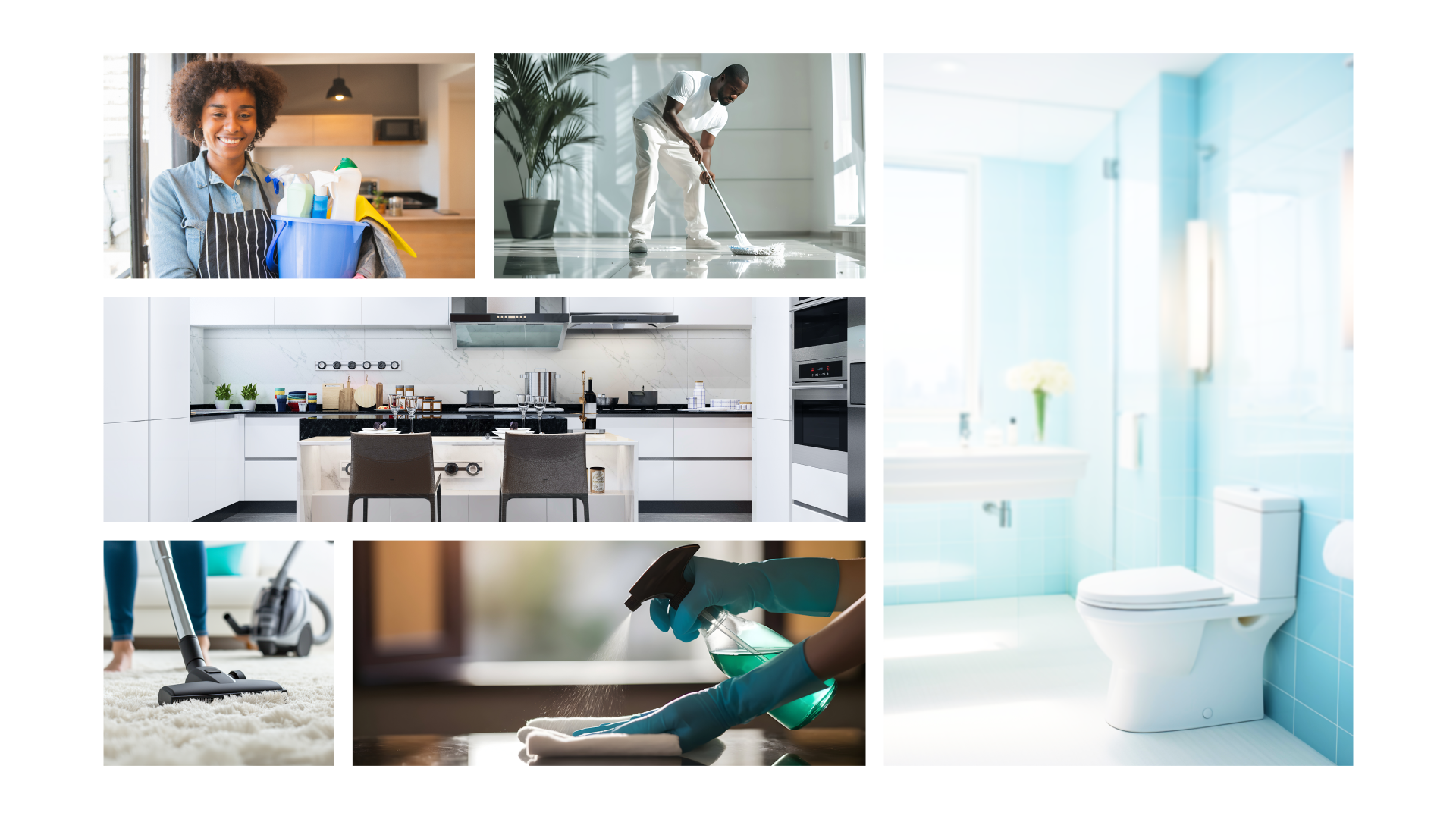
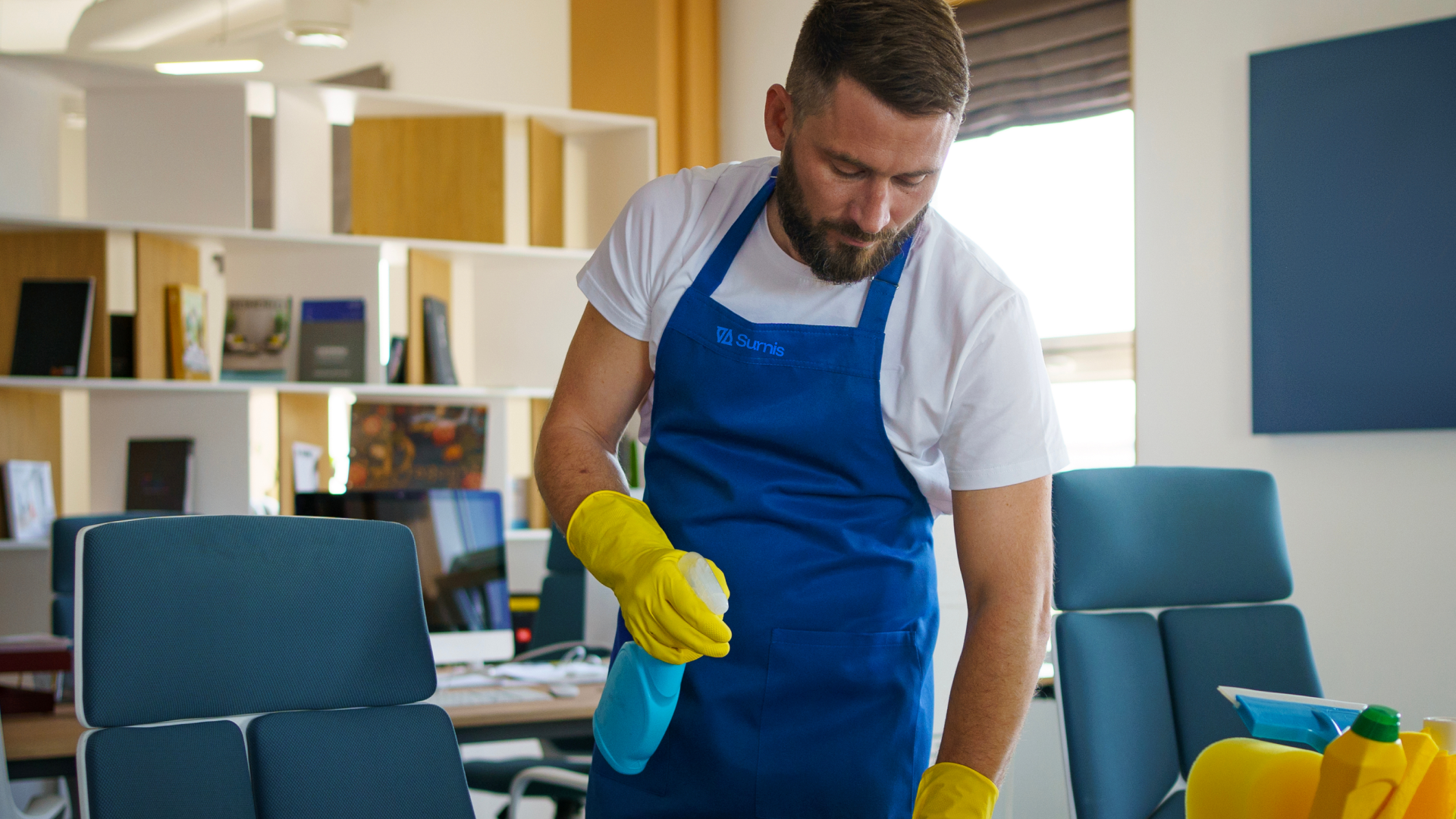
Most homes, offices, and apartments rely on routine or surface-level cleaning that leaves behind hidden dirt, germs, and cluttered spaces. This creates environments that may look tidy on the outside but lack true freshness, hygiene, and order. Traditional cleaning services often fail to combine deep care, professionalism, and consistency, leaving clients dissatisfied and spaces falling short of their full potential. Surnis exists to solve this problem, delivering deep, refined cleaning and space maintenance that goes beyond appearance, creating environments that inspire well-being, productivity, and peace of mind.
// Strategy
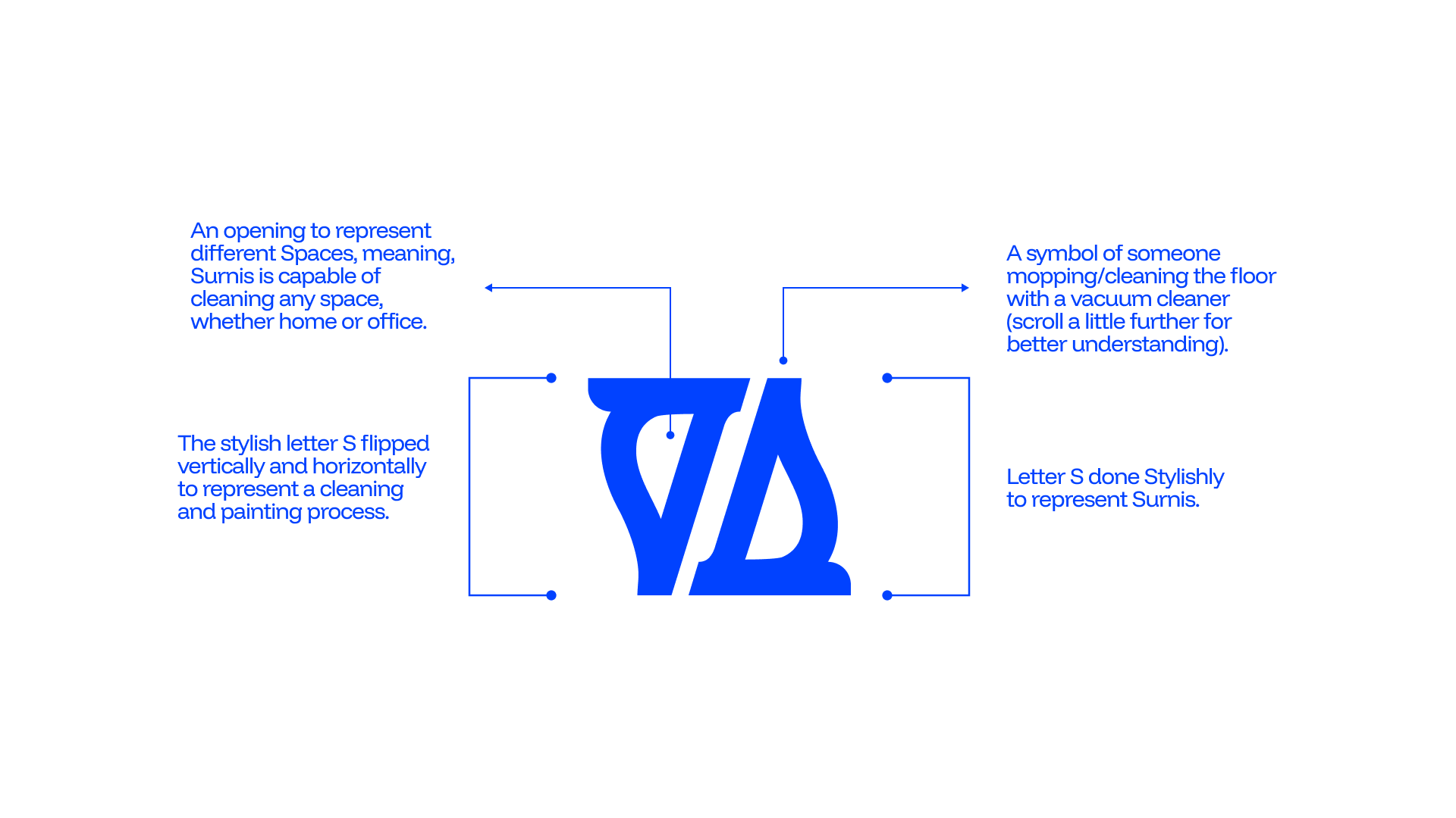
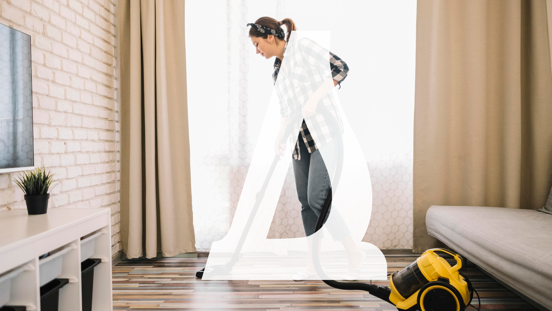
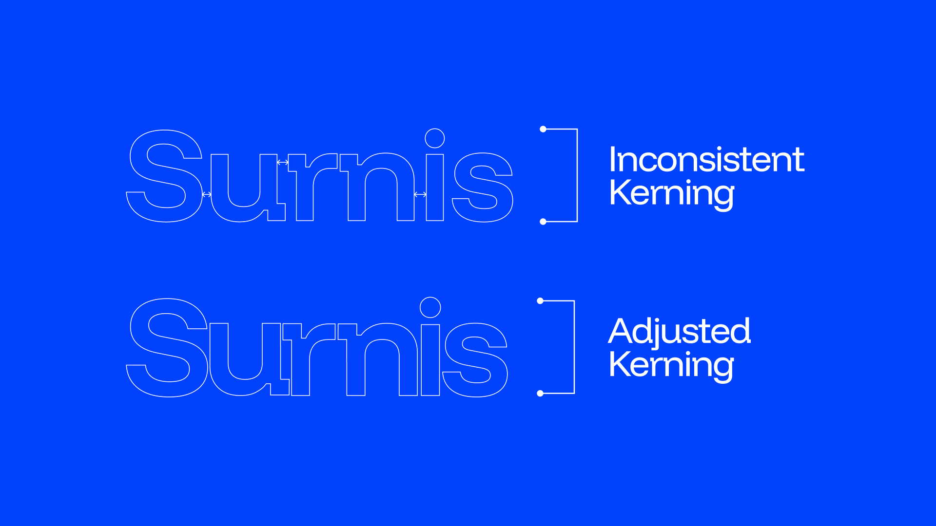
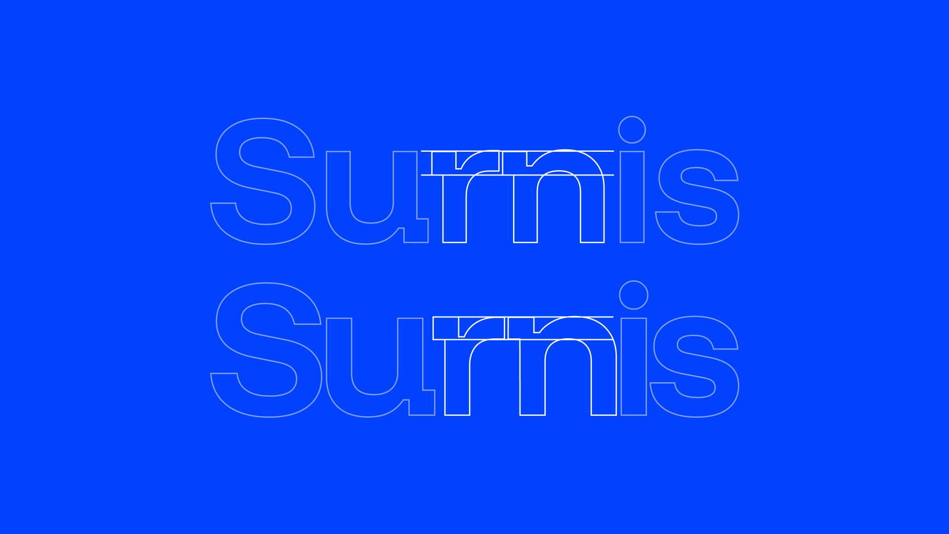
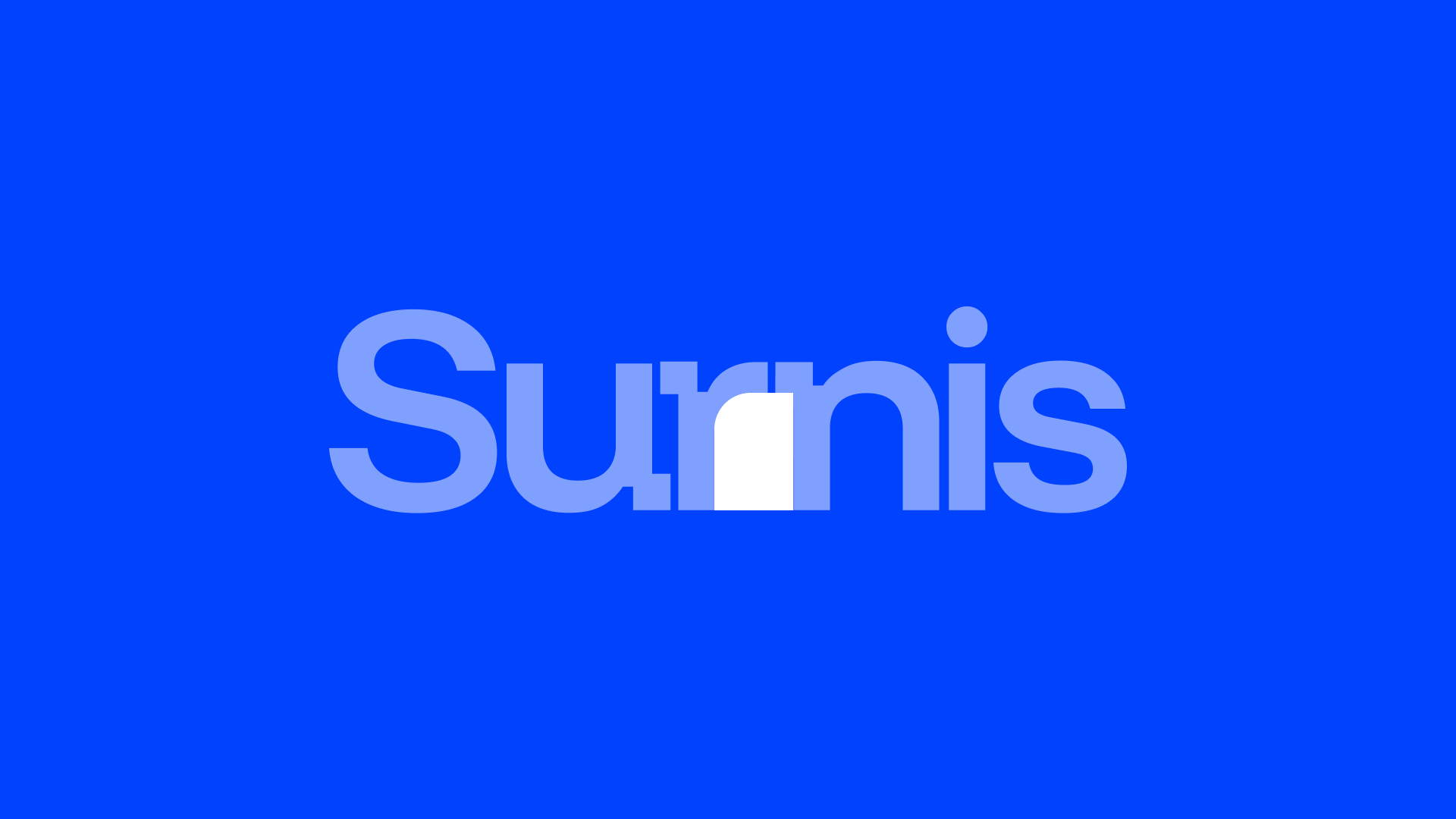
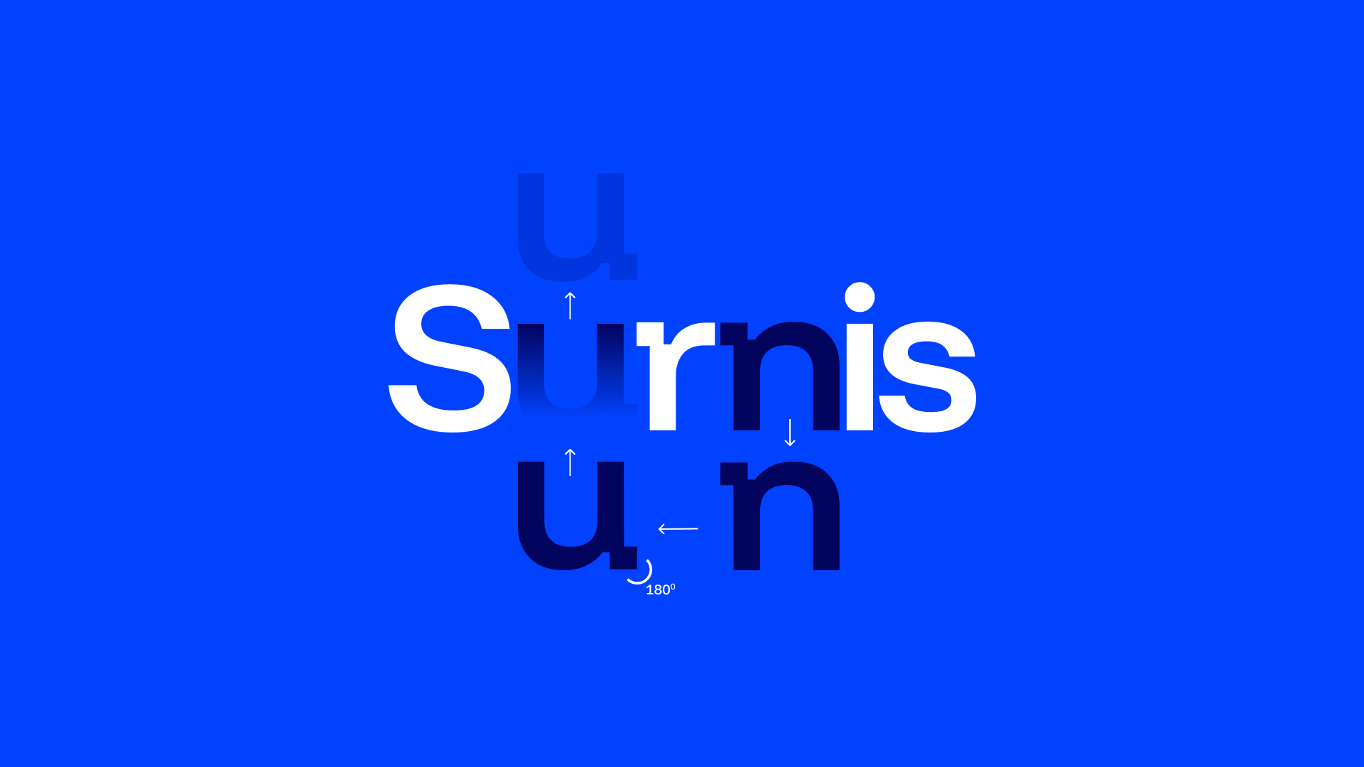
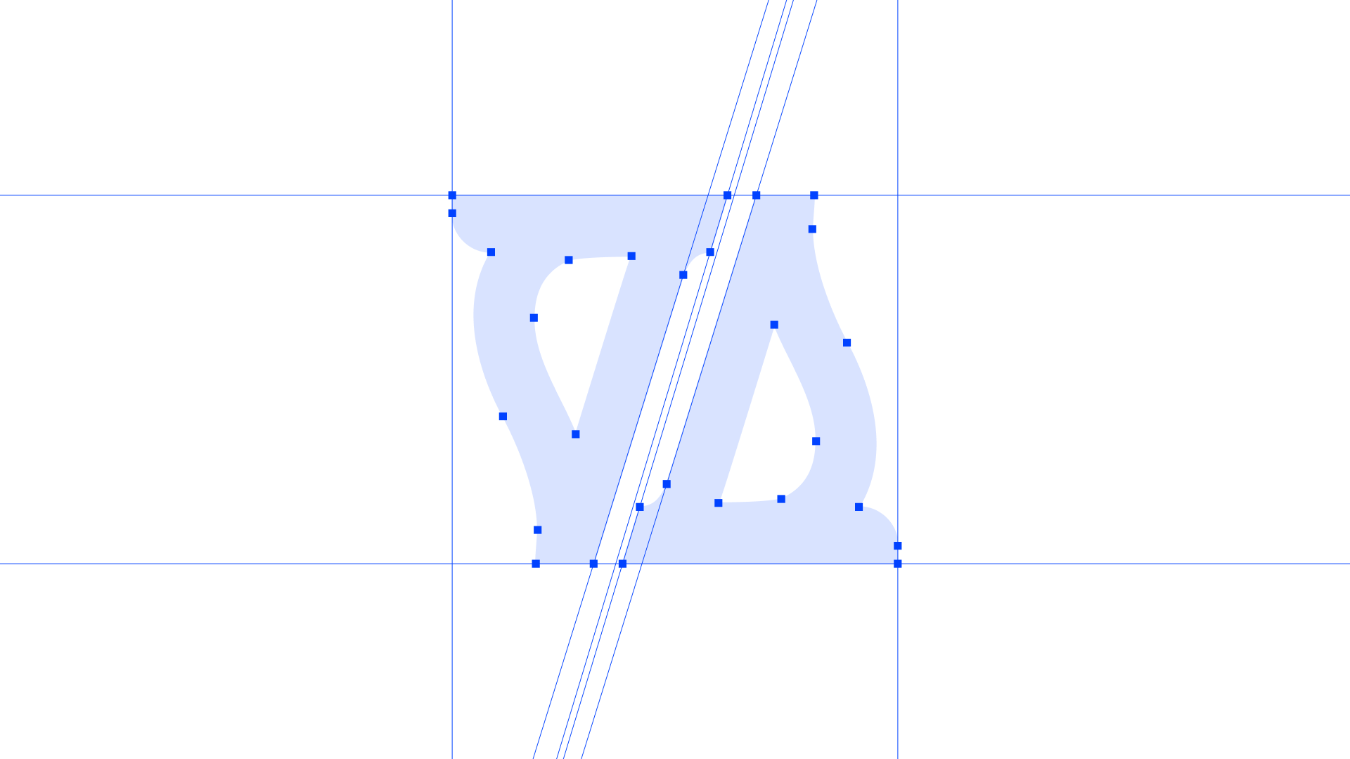
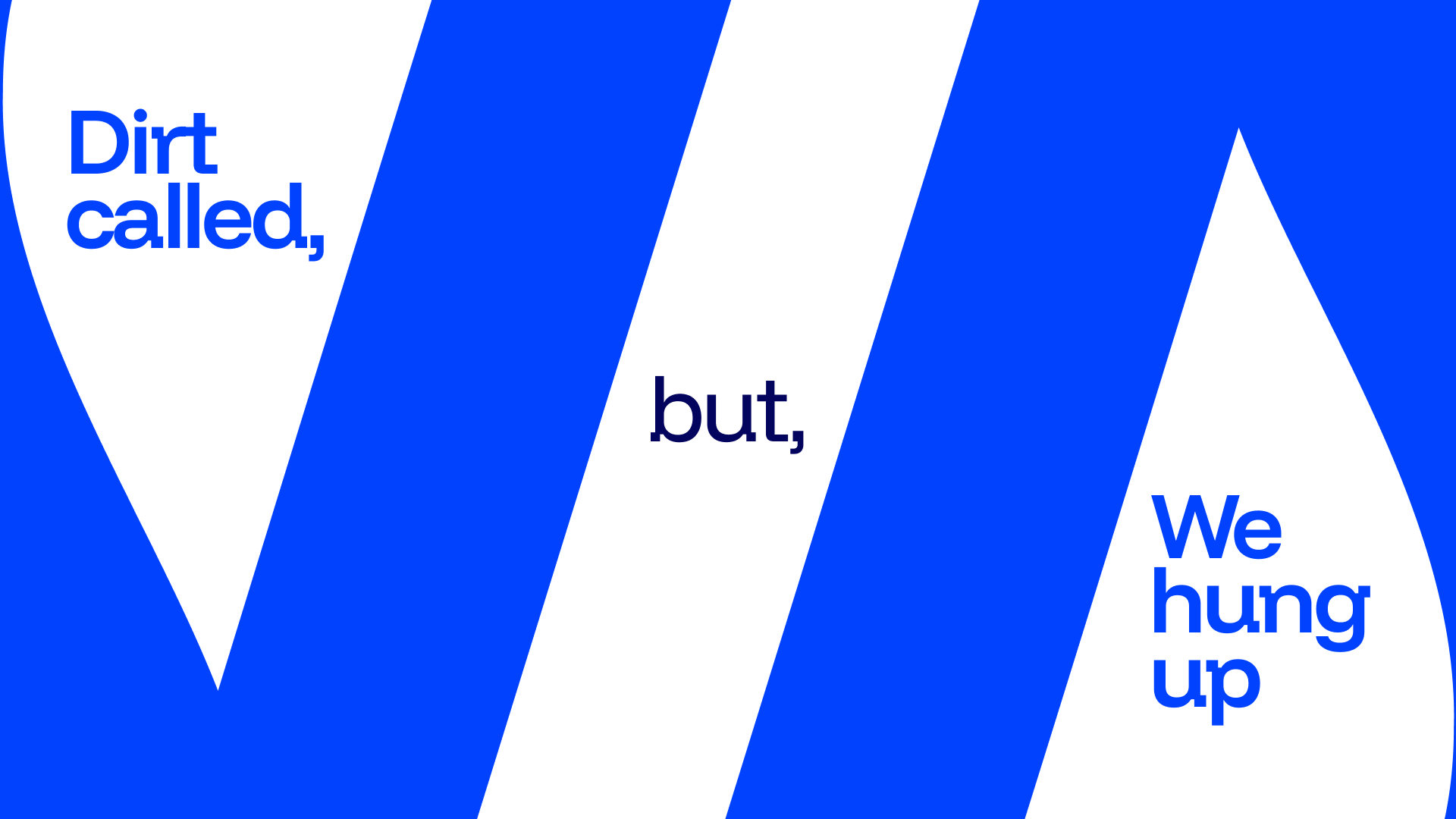
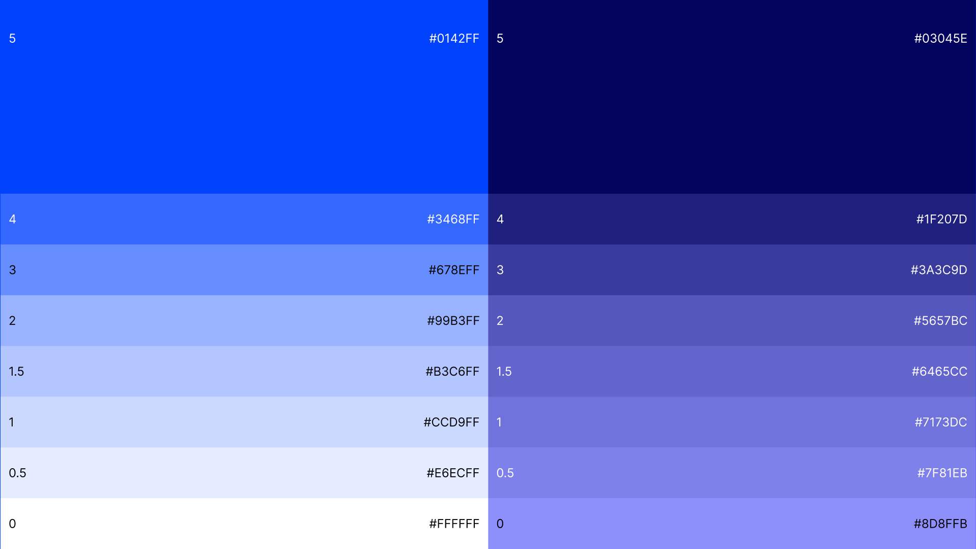
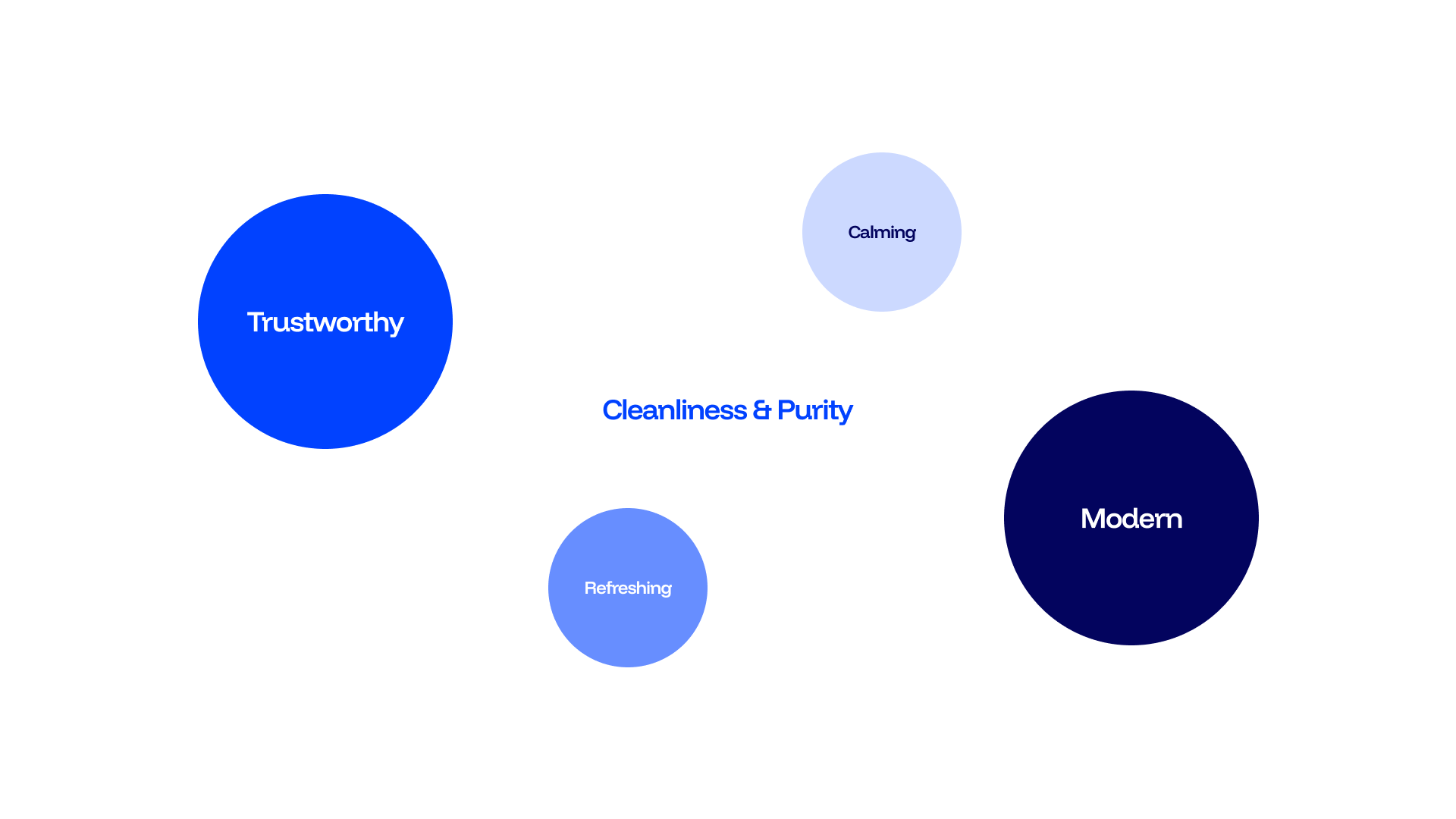
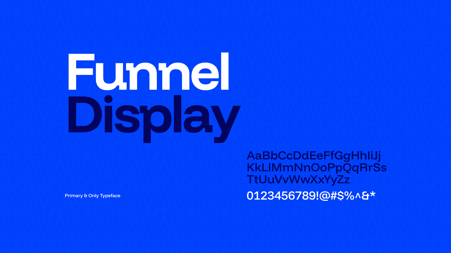
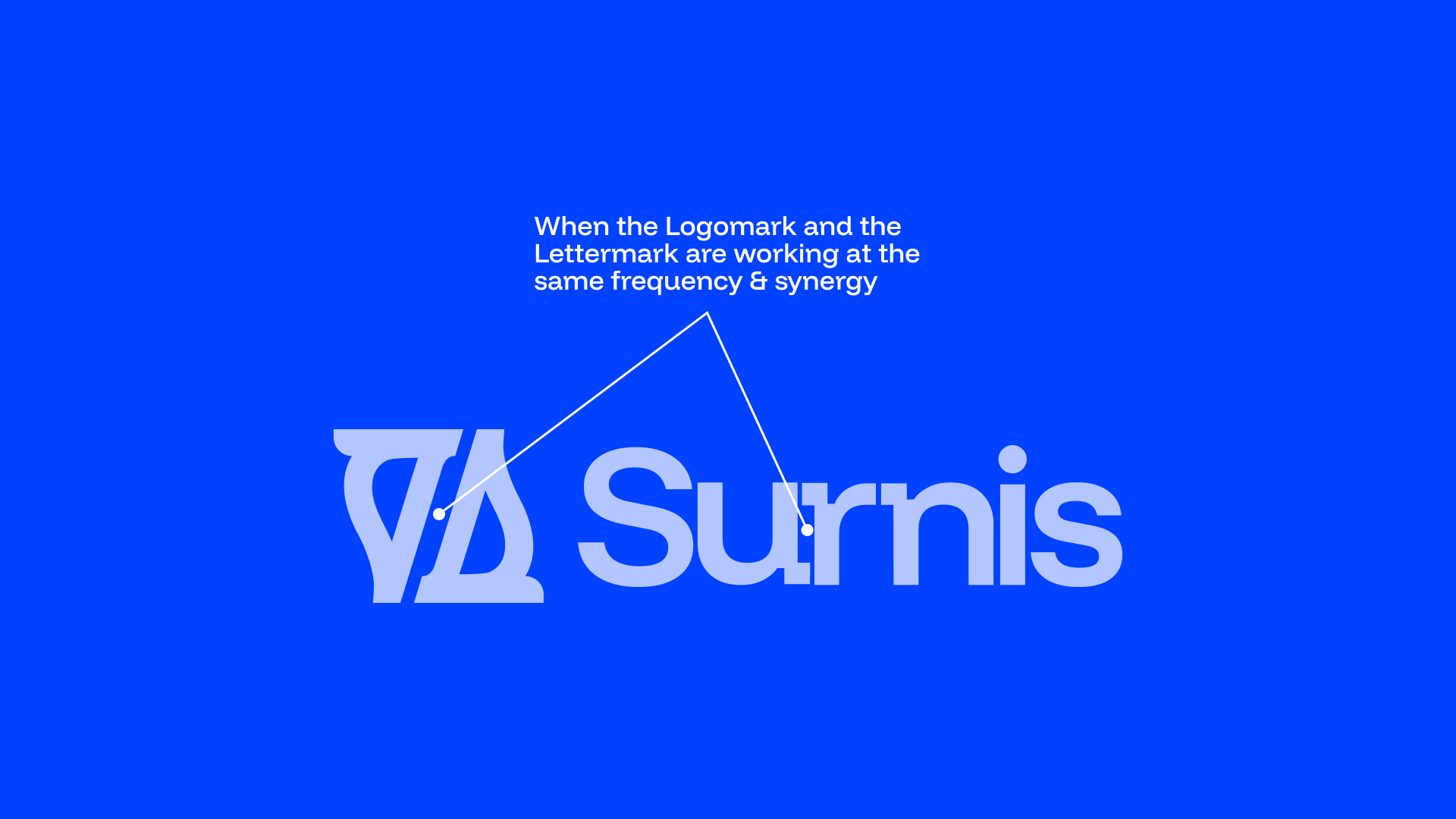
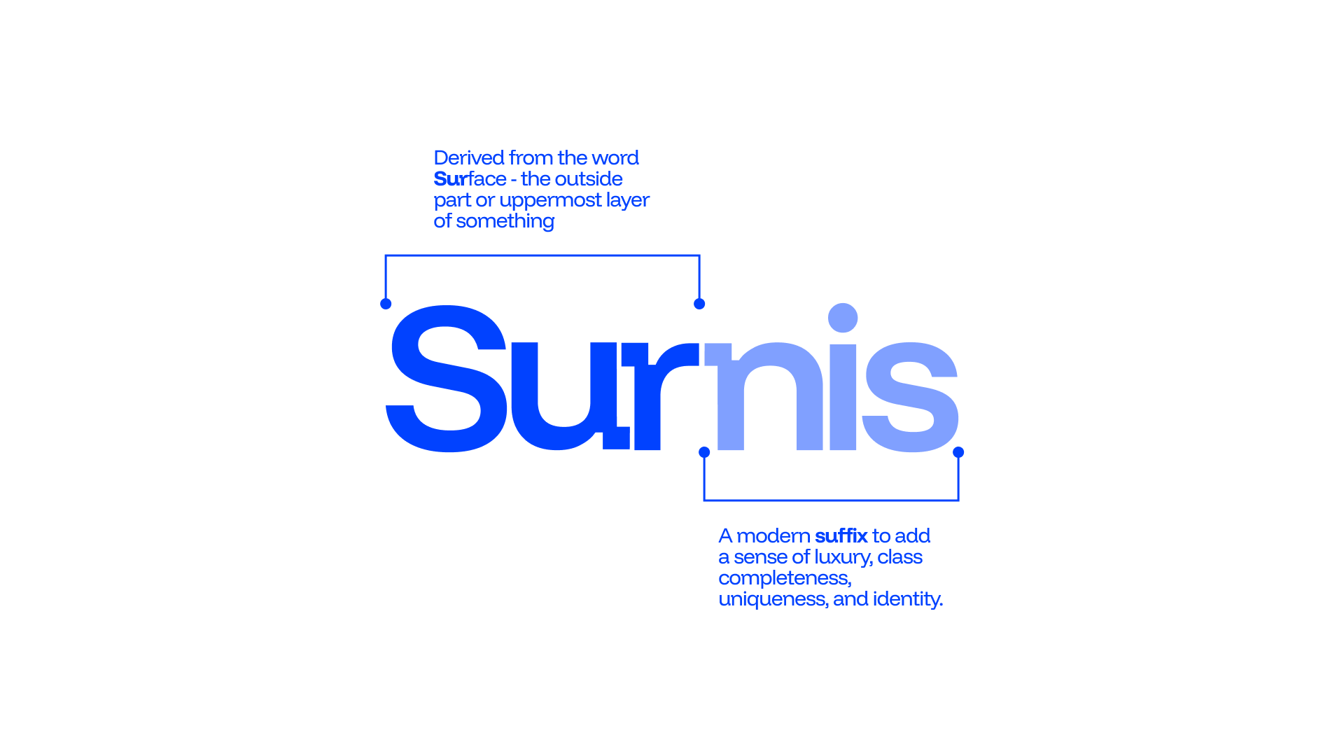
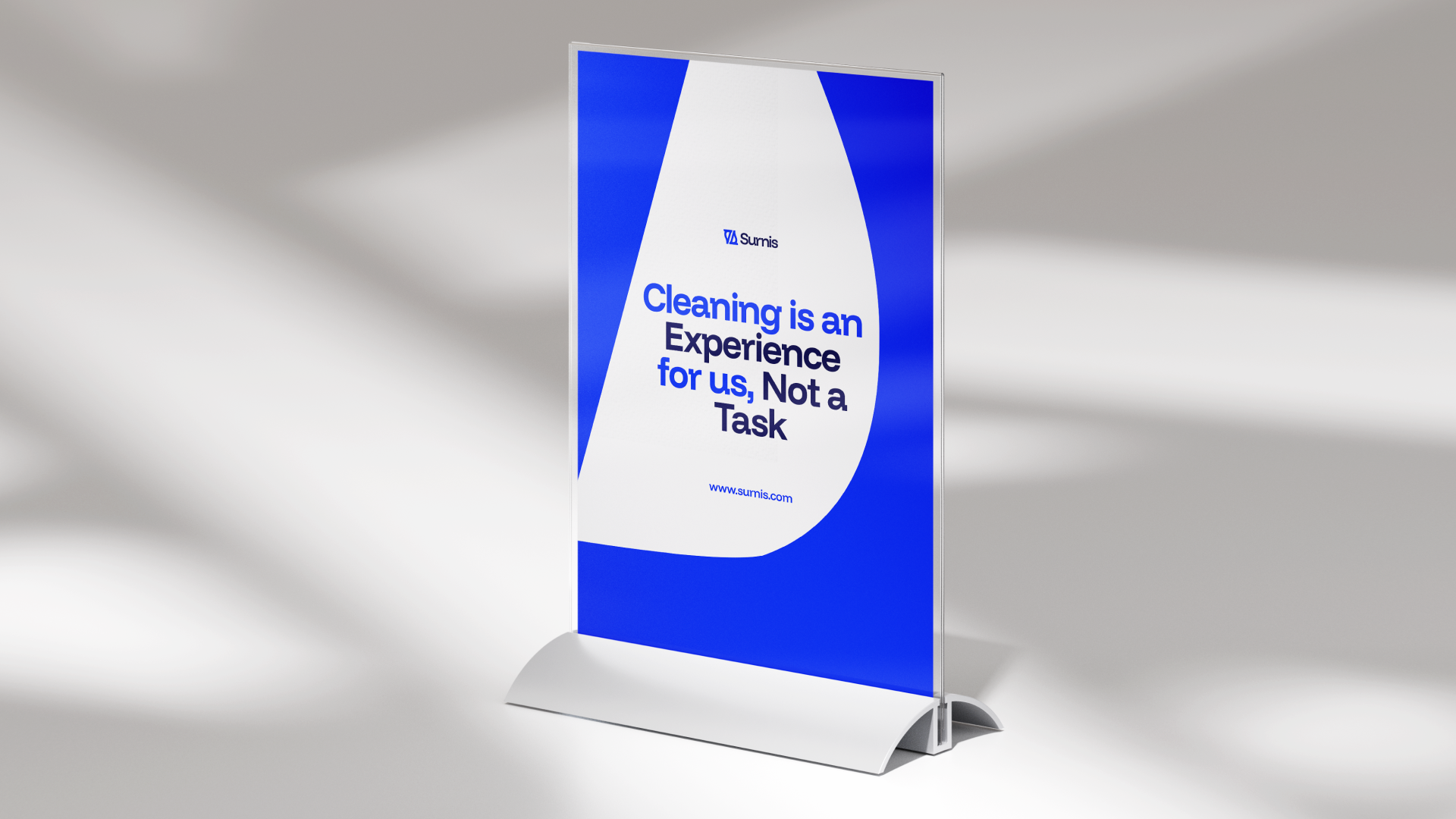
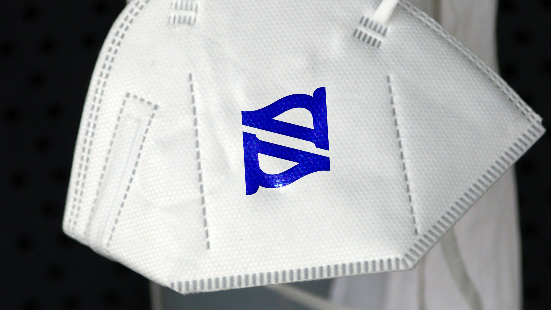
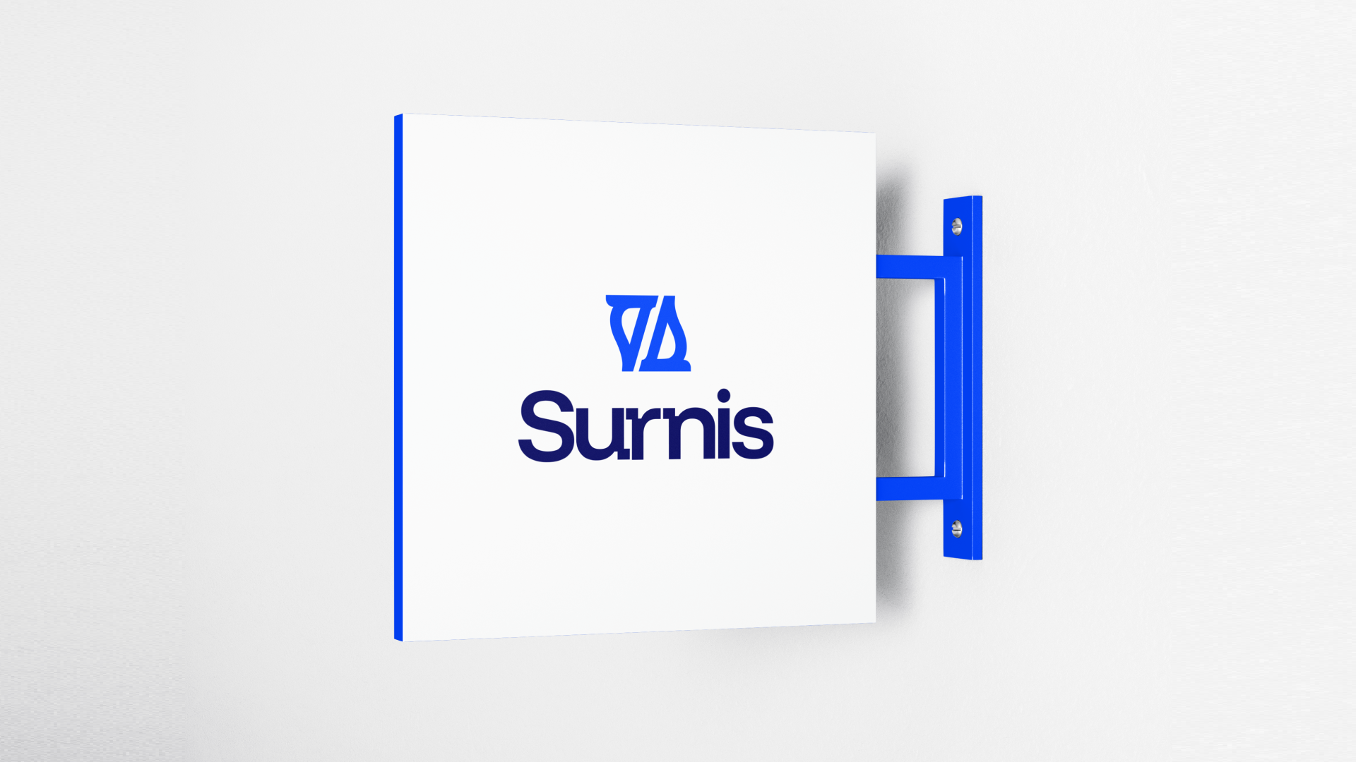
Surnis goal is to redefine how people experience cleanliness, transforming it from a task into a lifestyle standard. Through innovation, precision, and eco-conscious practices, Surnis aspires to become the leading name in deep cleaning and maintenance, trusted to create homes, offices, and apartments that embody comfort, productivity, and peace of mind. Surnis responds to the need for true, deep cleanliness by establishing itself as more than a service provider, it becomes a symbol of refinement, trust, and elevated living. The branding and design system were developed to reflect this mission: clean lines, balanced typography, and a modern logomark that subtly embodies transformation and space care. The logo, with its stylized “S” forms and open structure, visually represents versatility, renewal, and the act of cleaning across different spaces. Yet, it is the overall identity, color choices that convey freshness and professionalism, typography refined for clarity and harmony, and a consistent brand voice, that communicates Surnis’ promise of precision and care. This design solution ensures that every brand touchpoint, from logo to messaging, reinforces Surnis as a premium, dependable partner in maintaining spaces that inspire well-being, productivity, and peace of mind.
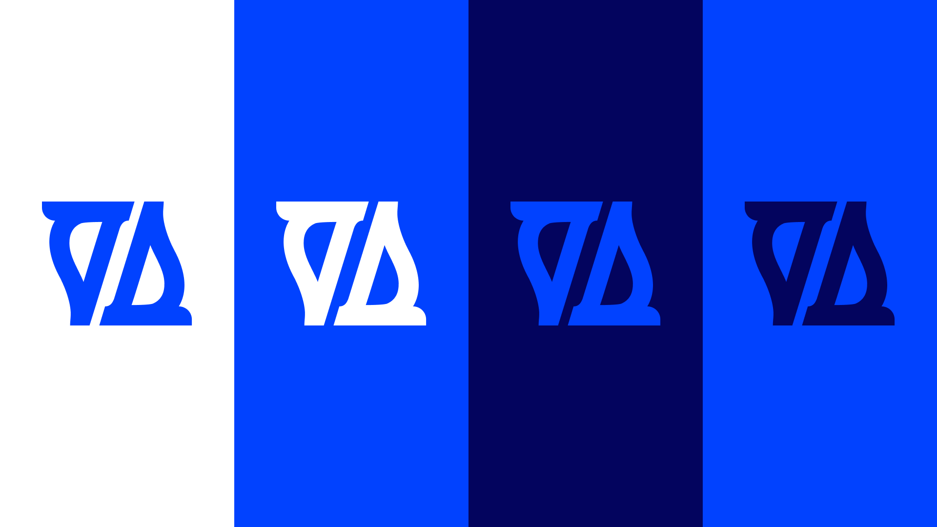
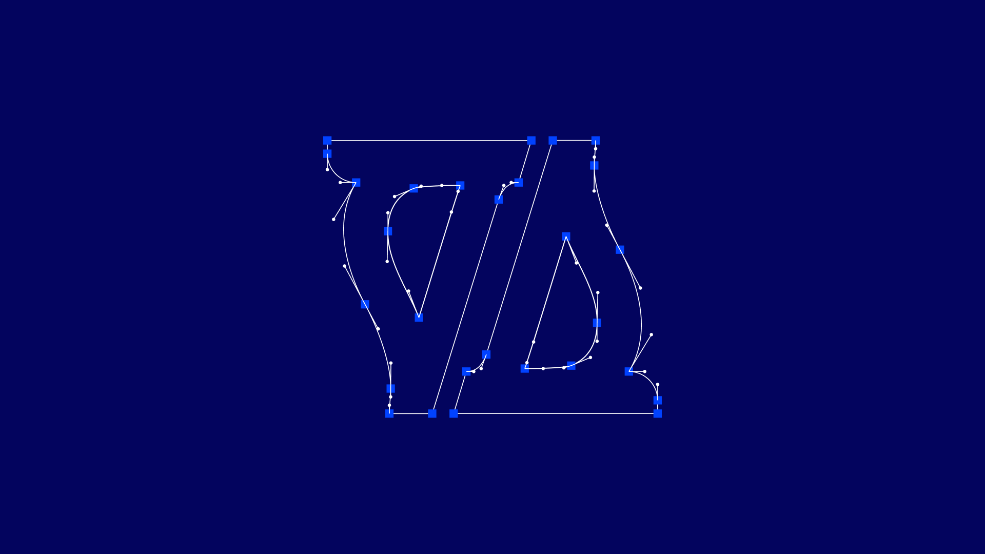
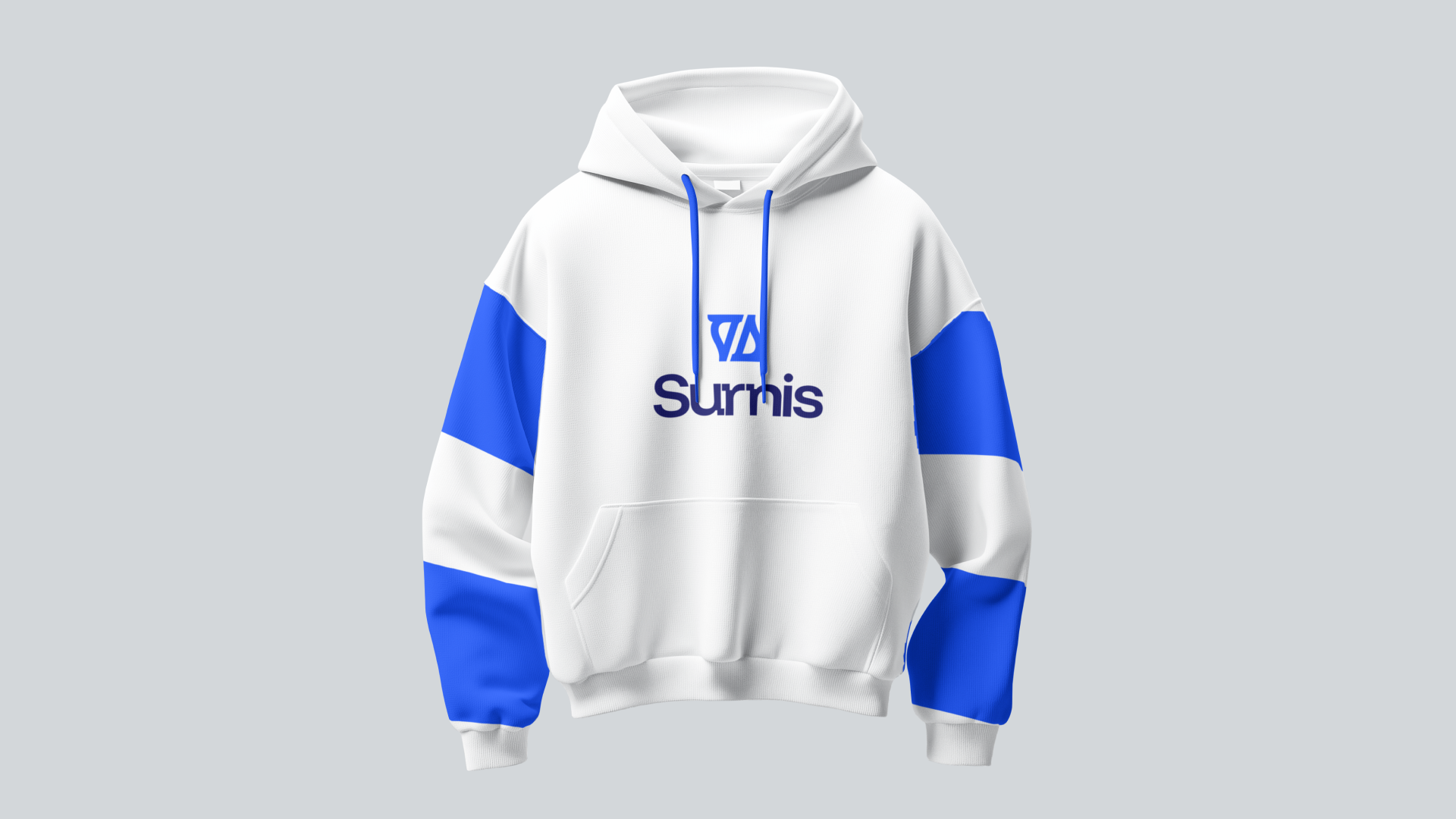
Identity Foundations
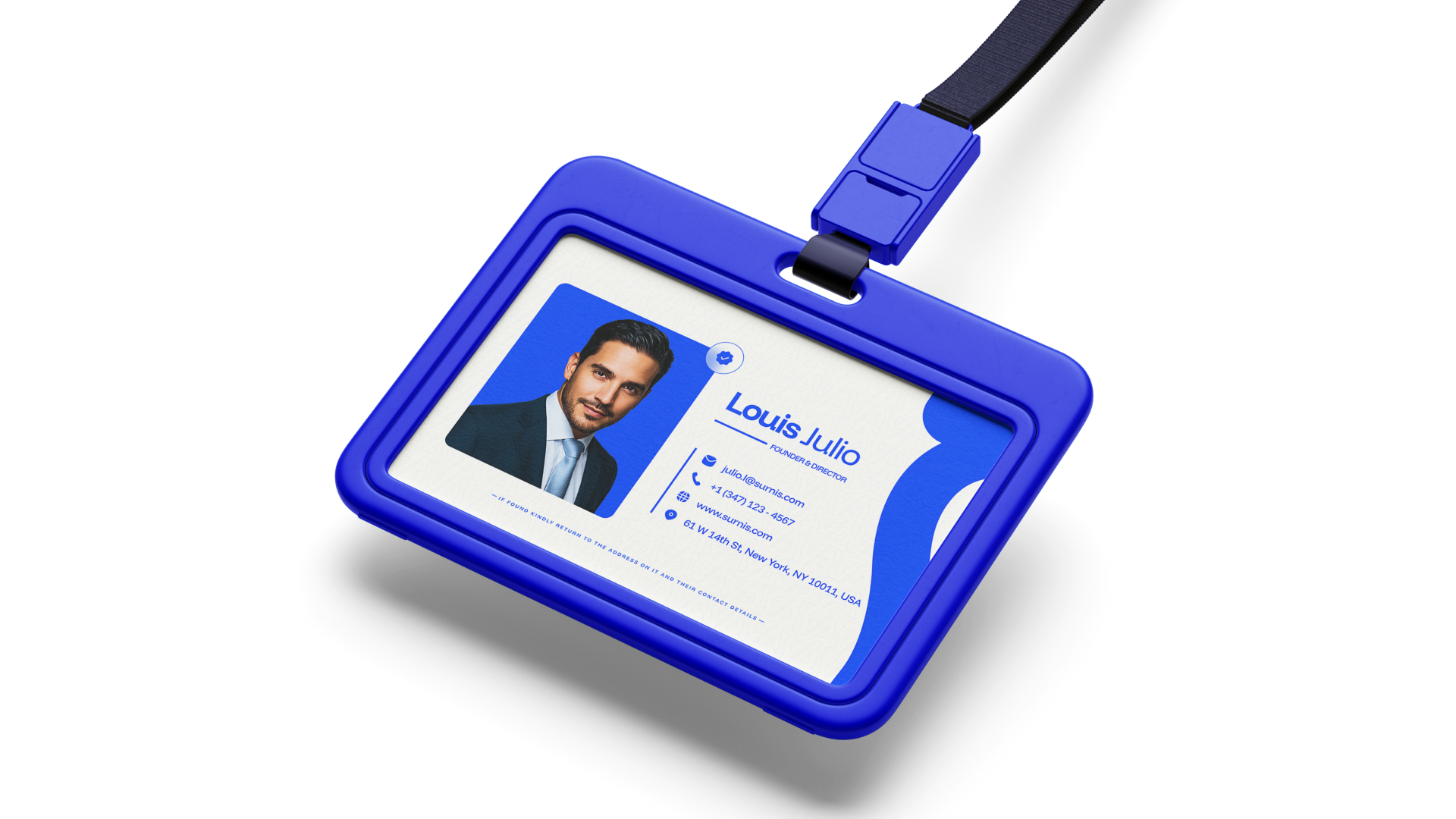
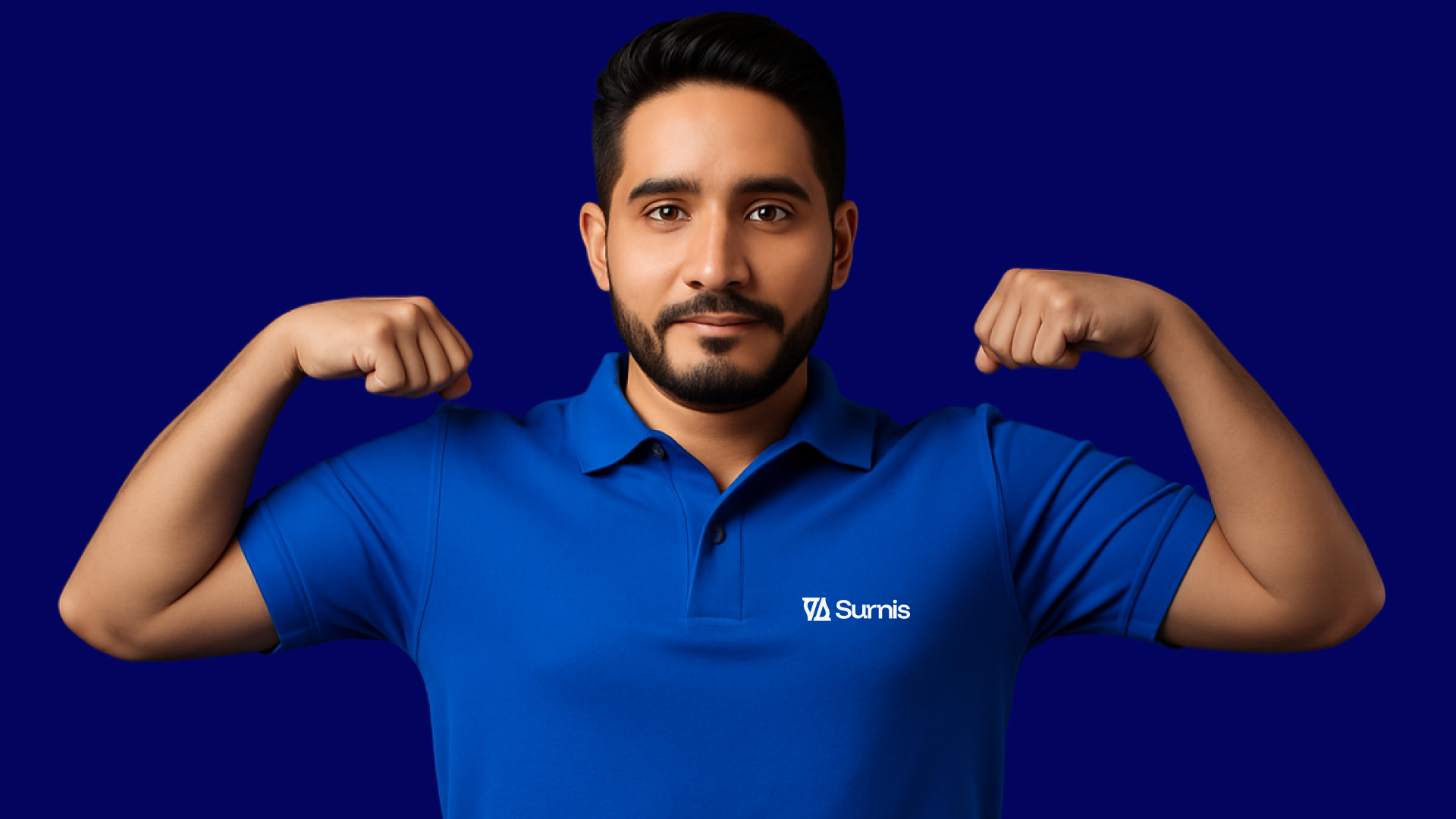
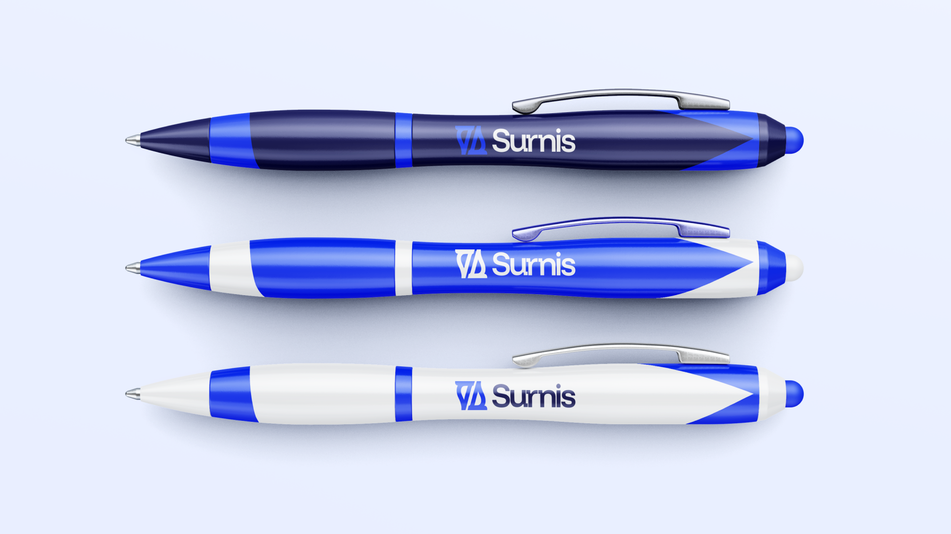
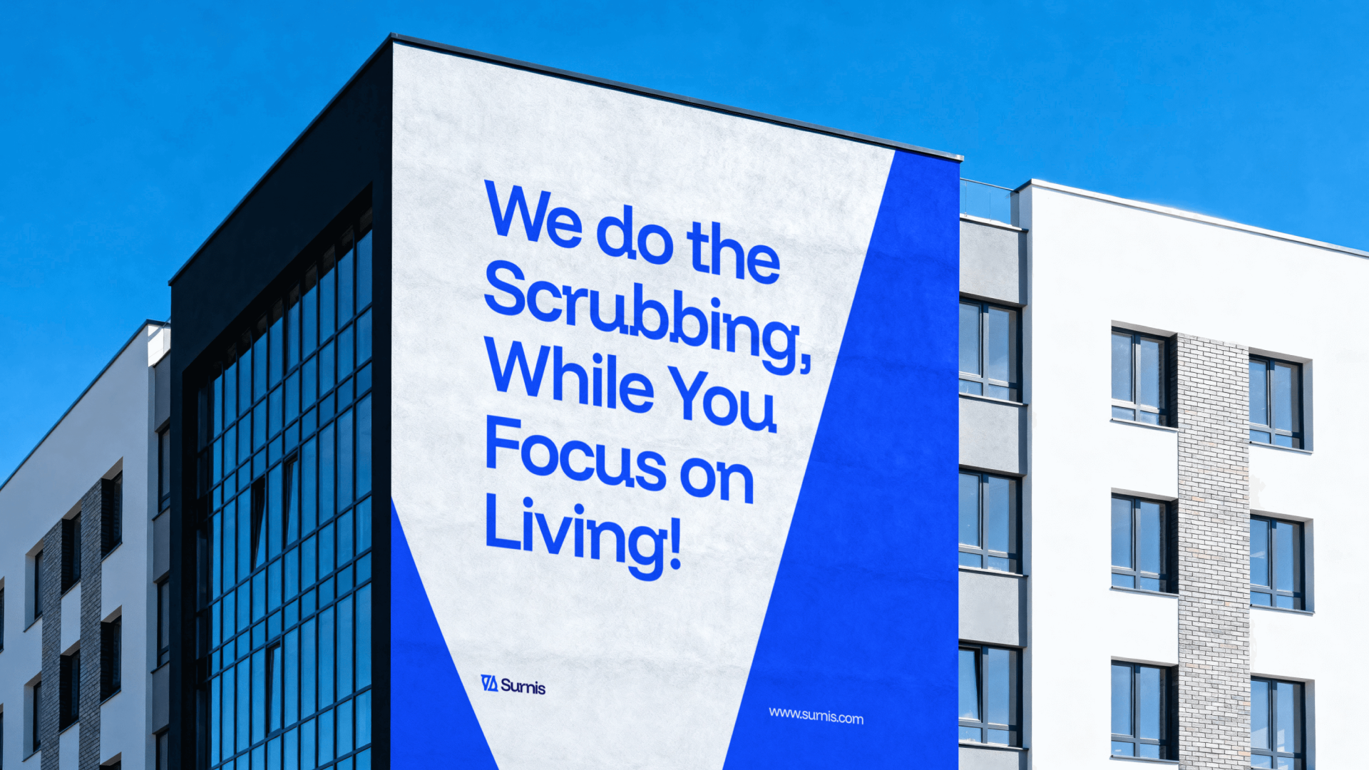
Visual Language & Brand Applications
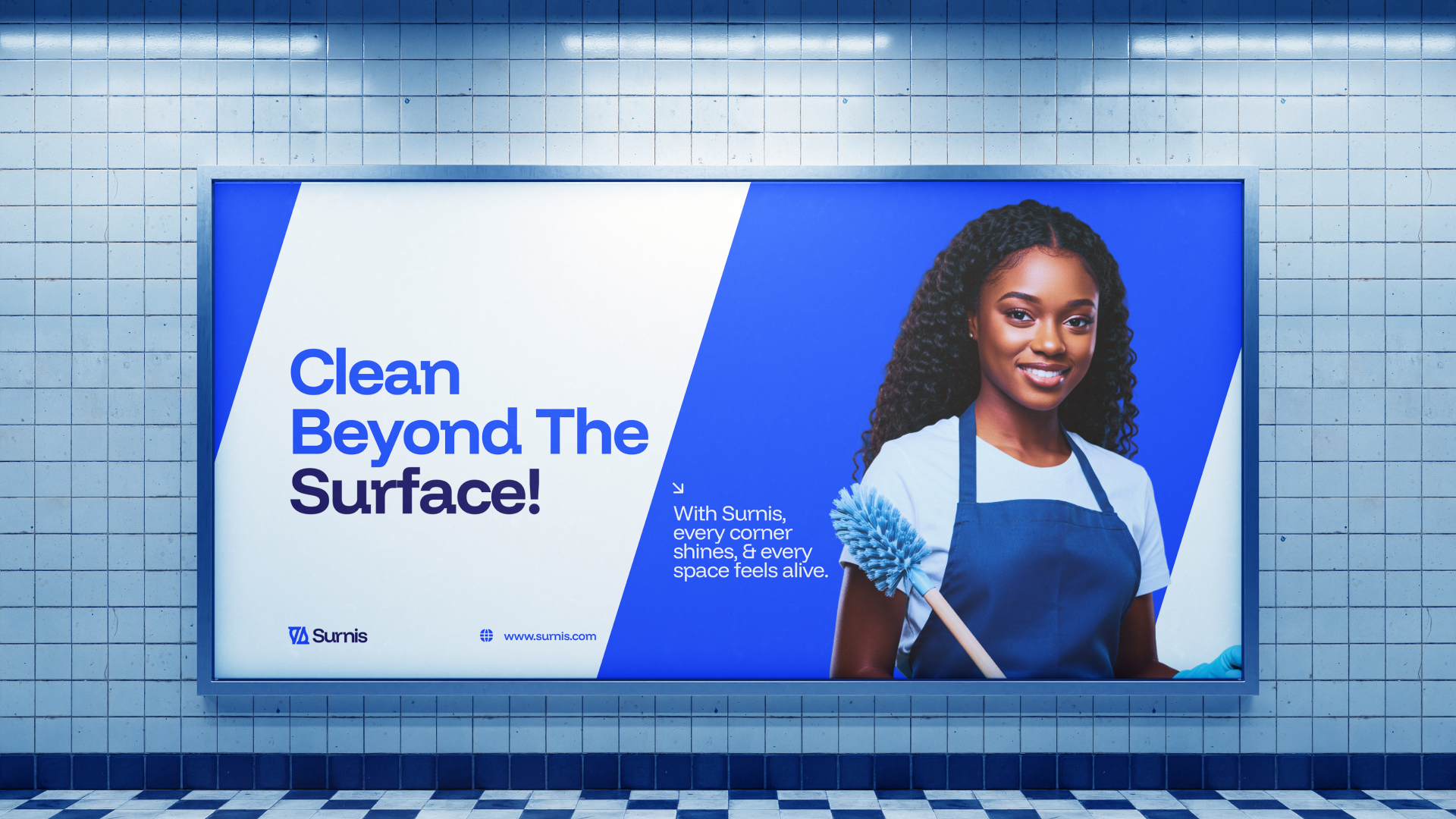
Extended Brand Rollout
// Outcome
The Surnis identity evolved into more than a logo. It became a complete visual system that communicates clarity, trust, and professionalism with confidence. Through careful refinement of its typeface, balanced negative space, and a tailored colour palette rooted in blue, the brand now feels modern, approachable, and highly memorable.
The final result is a distinctive and scalable identity that bridges functionality and aesthetics across digital and physical applications. From branded materials to environmental visuals, Surnis now shows up as a premium cleaning brand that is easy to recognize, easy to trust, and built for long-term recall.
Let’s shape a brand system that looks good, works clearly, and moves your business forward.
Whether you need a full identity system, visual strategy, website direction, or design support for an upcoming launch, this is the best next step.