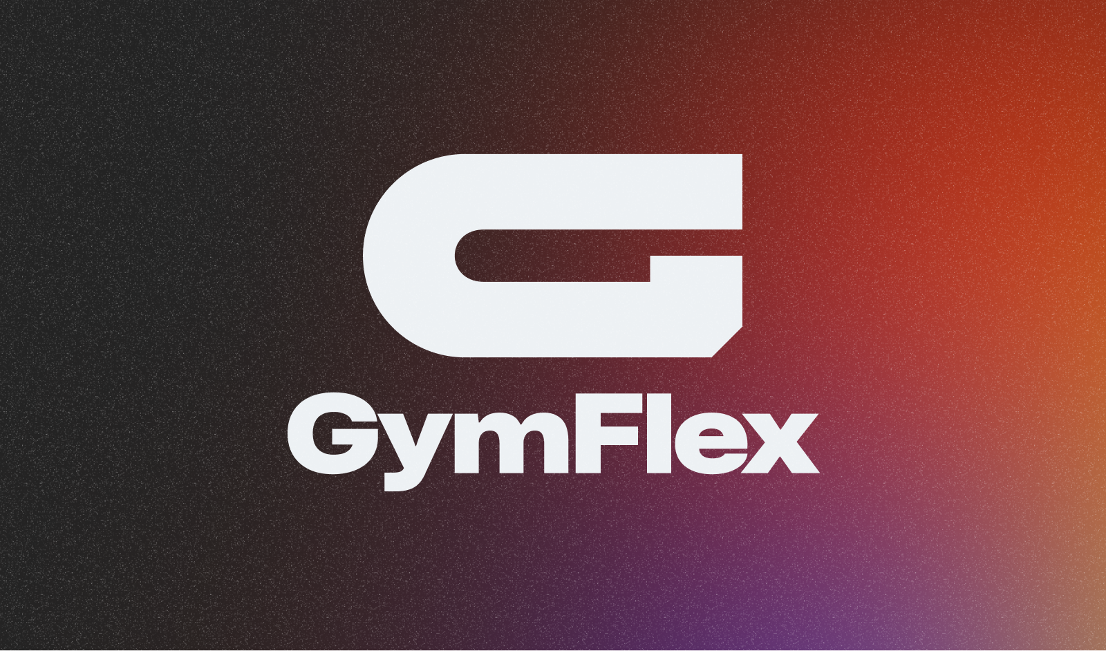
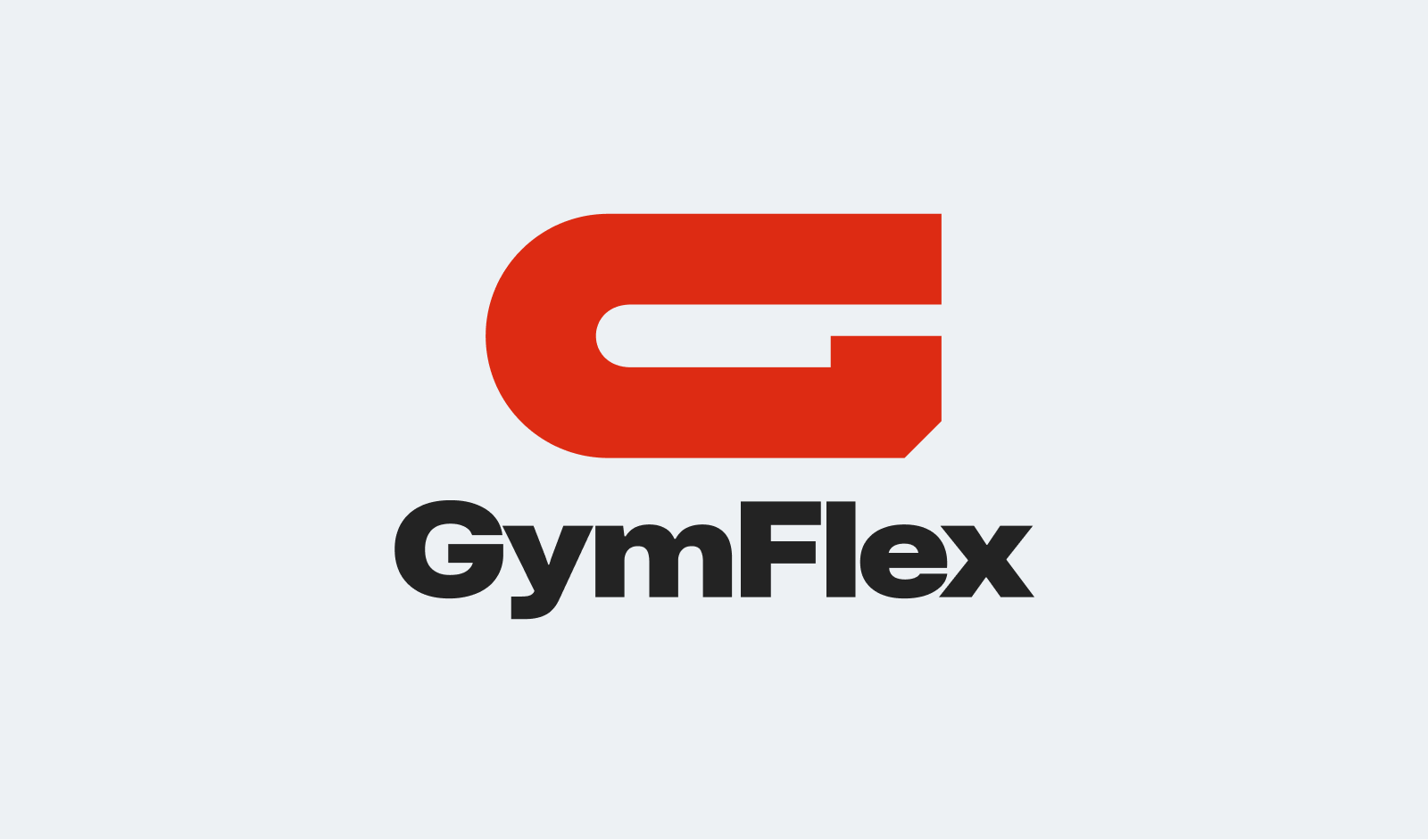
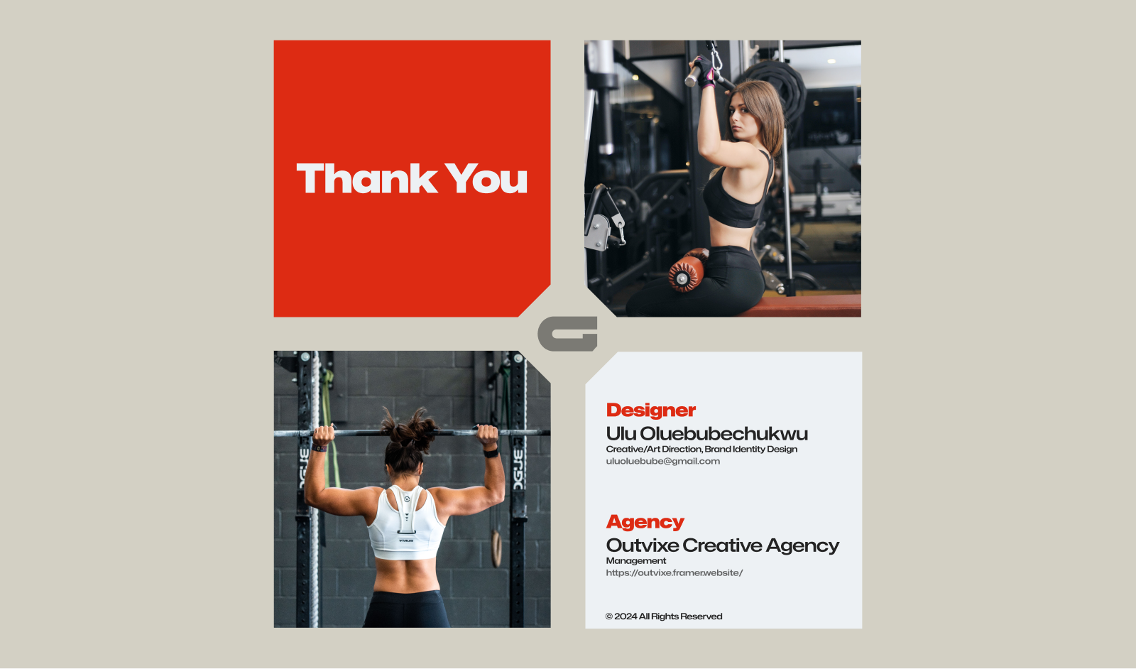
GymFlex
A bold fitness identity system built to communicate strength, agility, movement, and the drive to push beyond personal limits.
// Challenge
In the saturated landscape of fitness branding, many fitness brands fail to resonate on a visual level. The lack of a distinctive and memorable identity often creates a disconnect with the audience, while the visual noise in the industry makes it difficult for a brand to carve out a clear niche that communicates both power and versatility. Without a unique and recognizable brand identity, GymFlex faced the risk of blending into the crowd rather than standing out as a beacon of transformation.
// Strategy
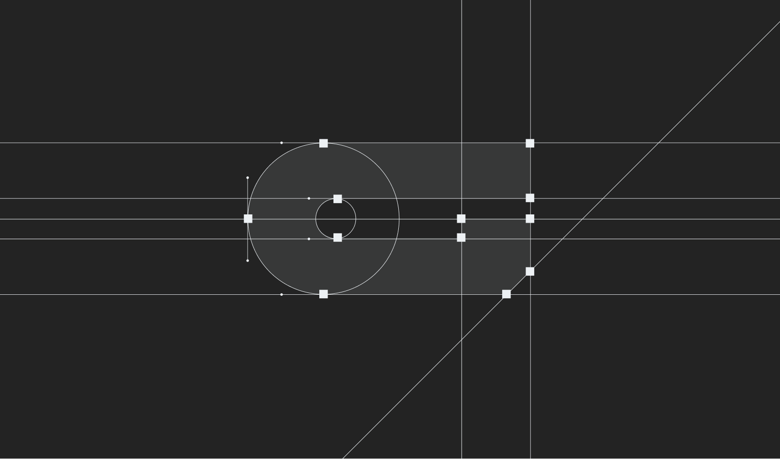
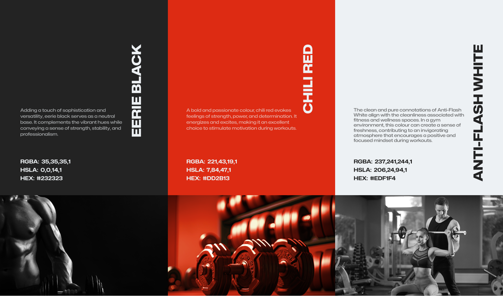
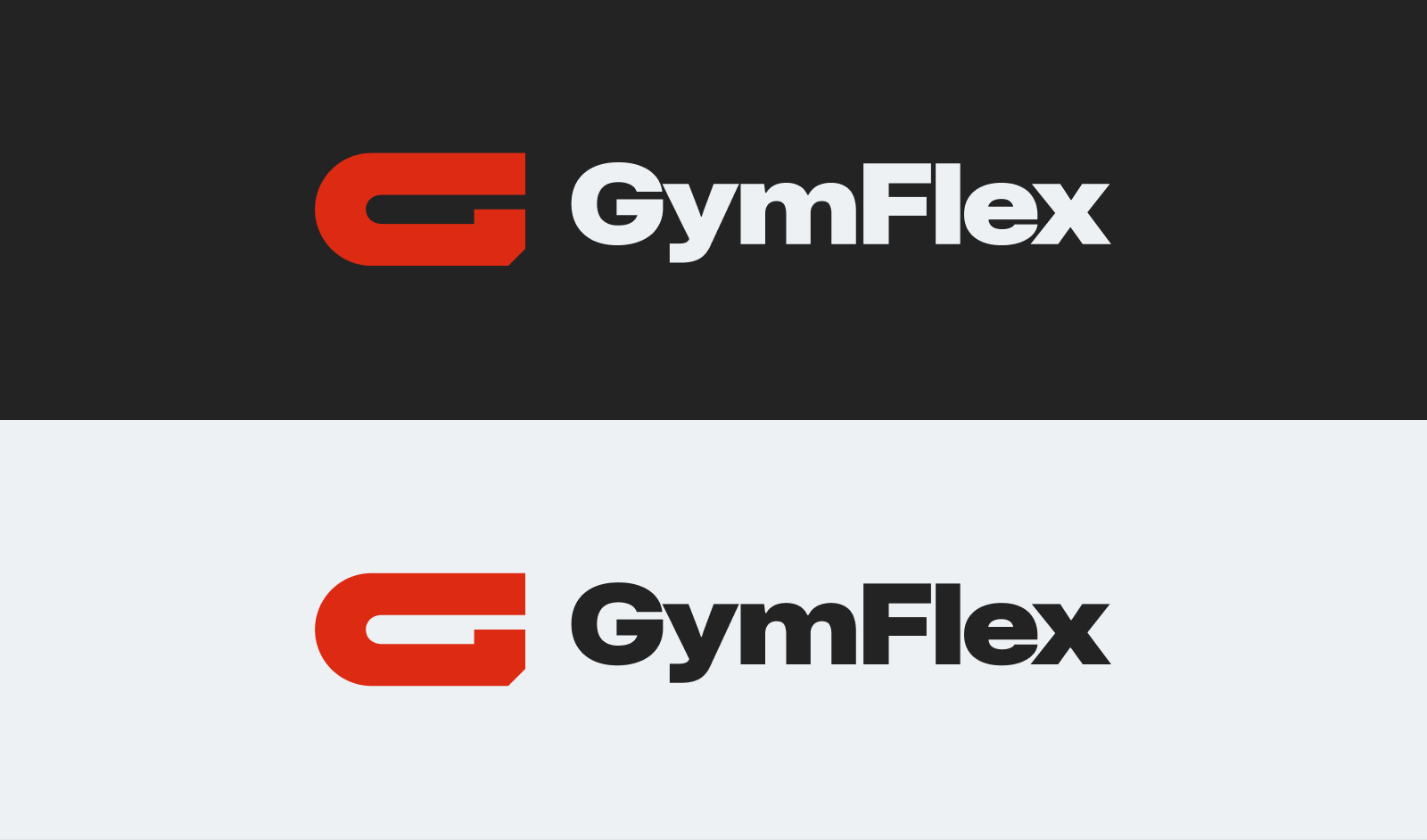
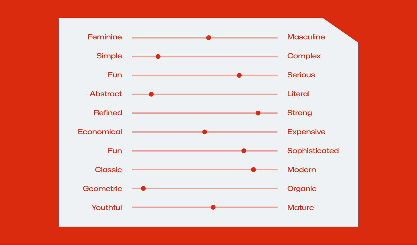
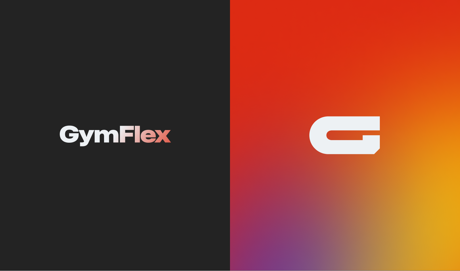
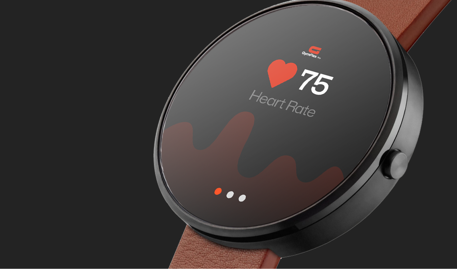
GymFlex logo and visual identity design was built around a G-shaped geometric logomark, where every angle and curve was meticulously created to convey strength, agility, and determination. The brand identity exudes vibrancy and energy through a carefully curated colour palette that complements the dynamism of the fitness programs. The geometric precision symbolizes the structured approach to wellness, while the fluidity of the design reflects the adaptability inherent in the training methodologies. GymFlex's brand identity is a visual manifesto, communicating its commitment to sculpting not just bodies but empowering lifestyles.
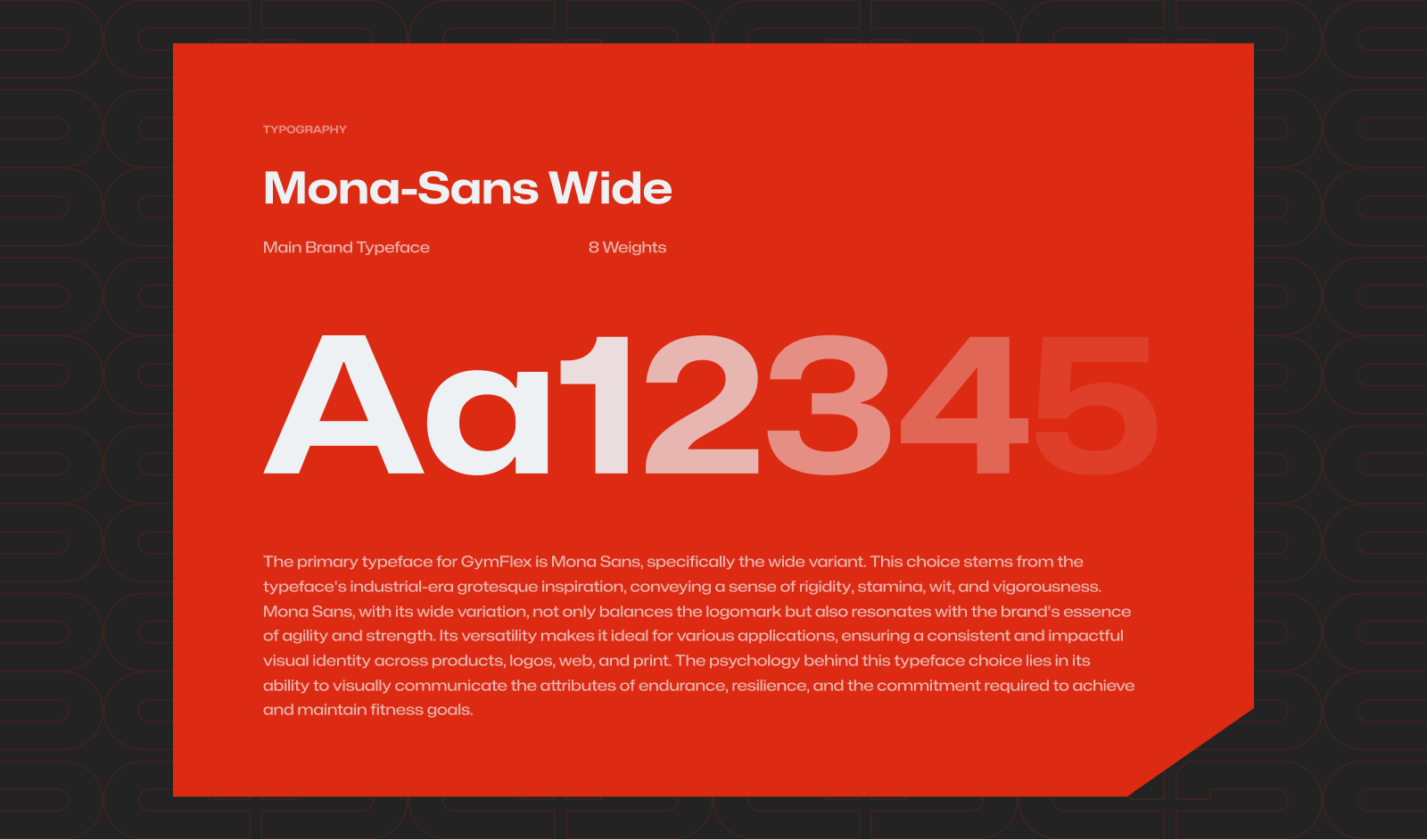
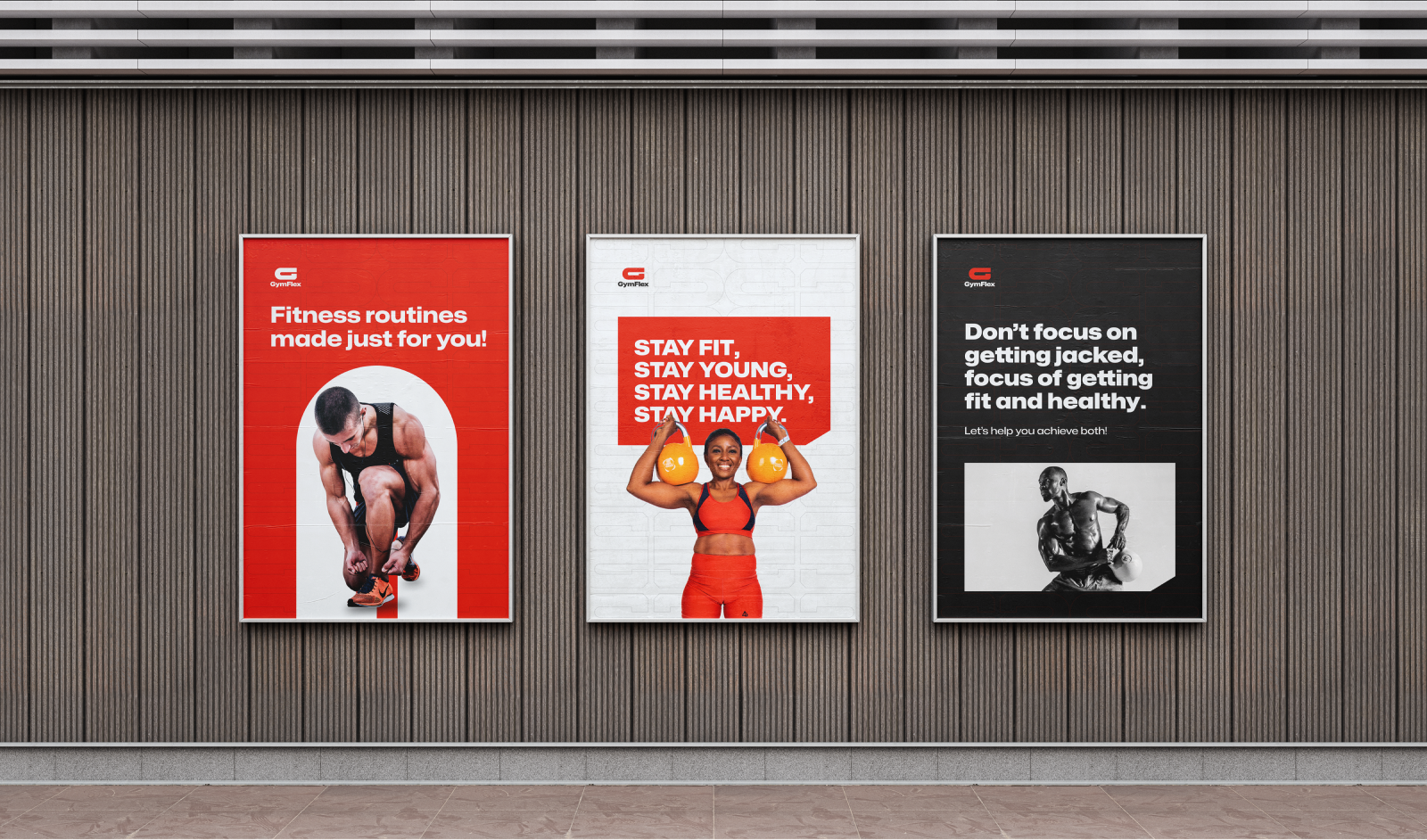
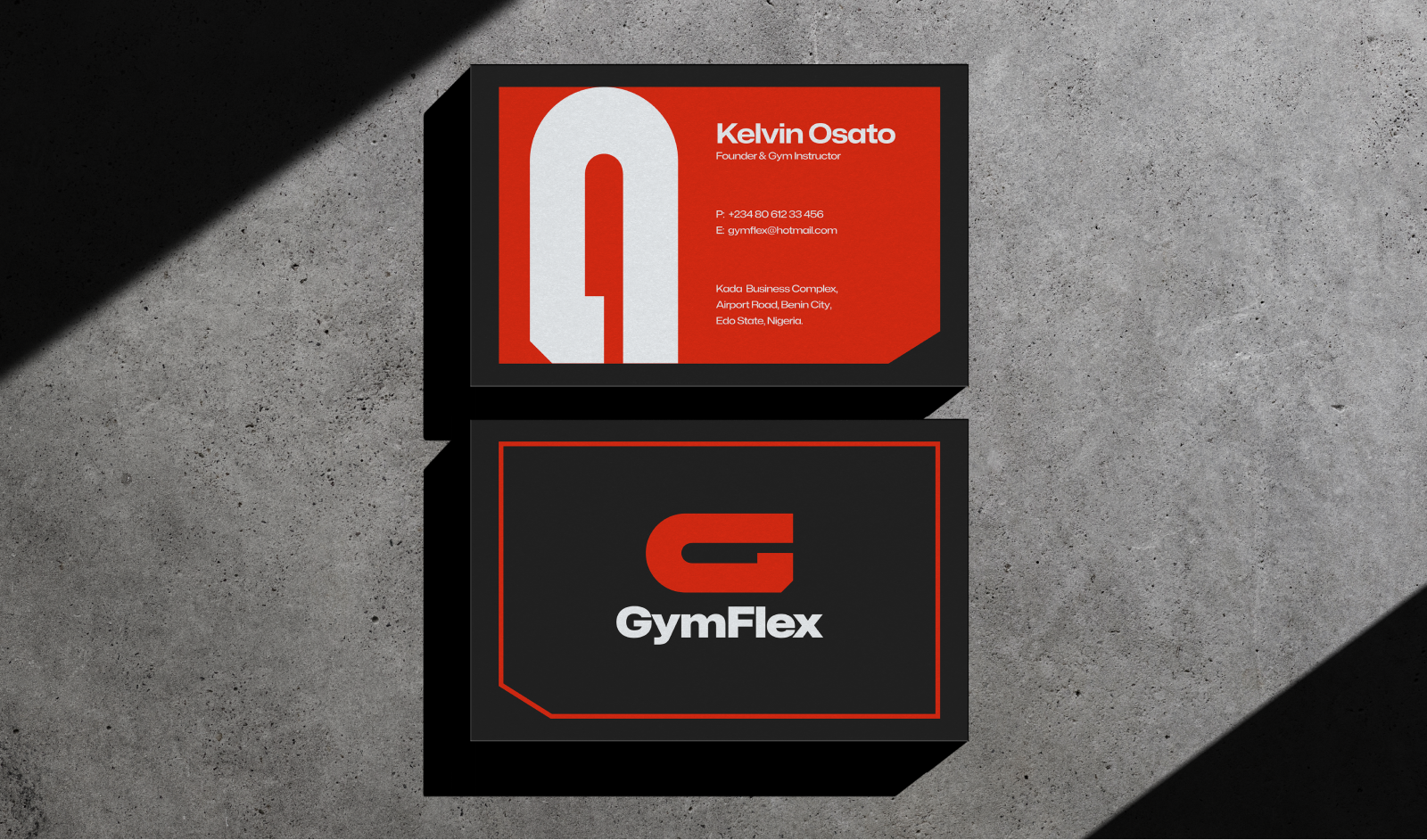
Logo System & Brand Foundation
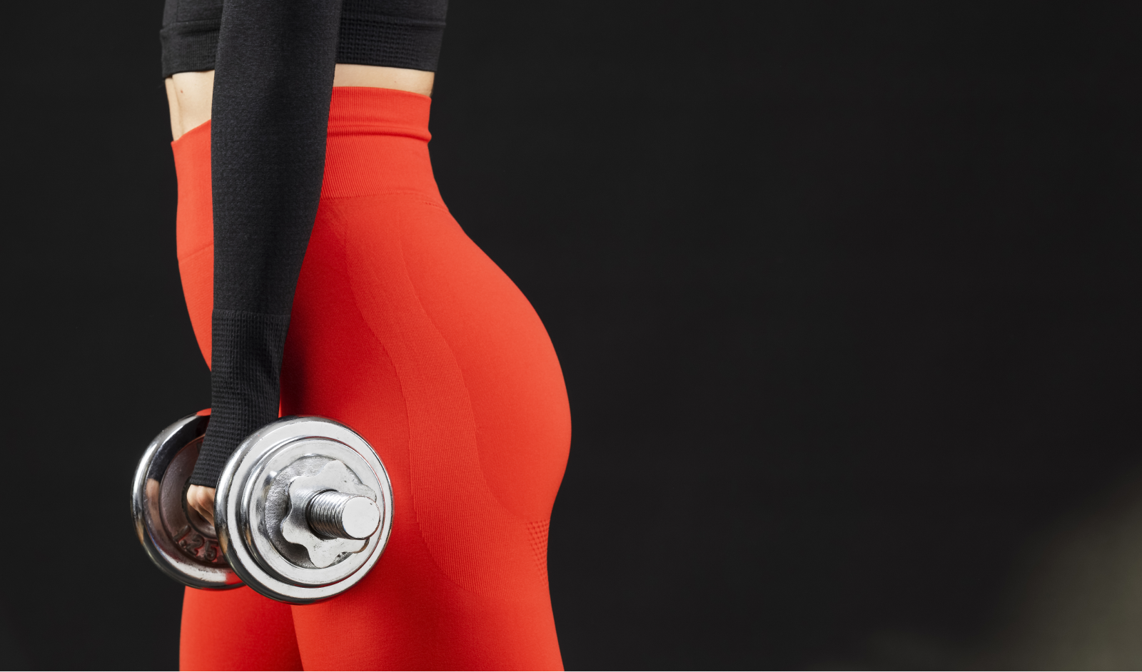
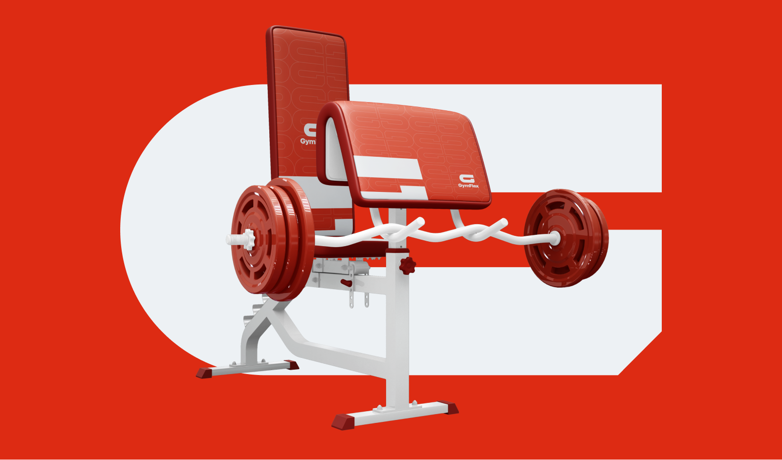
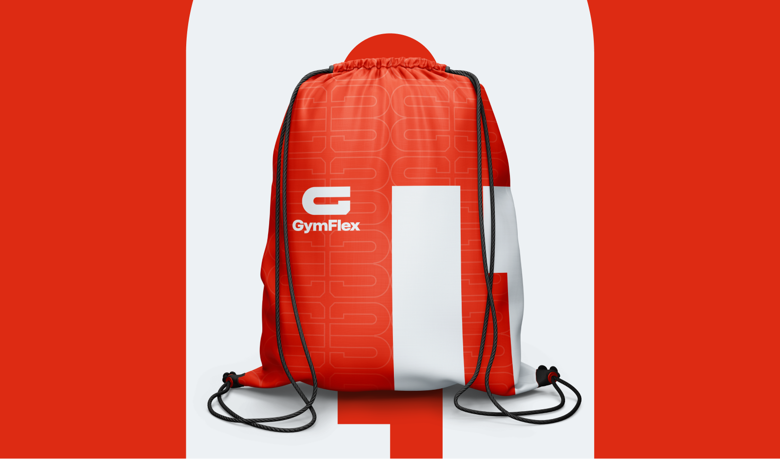
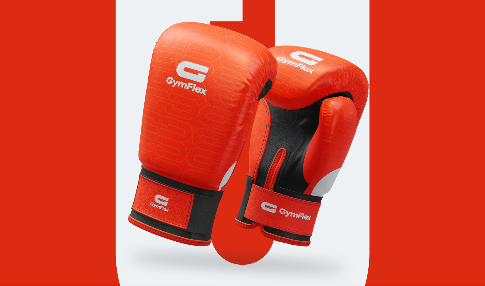
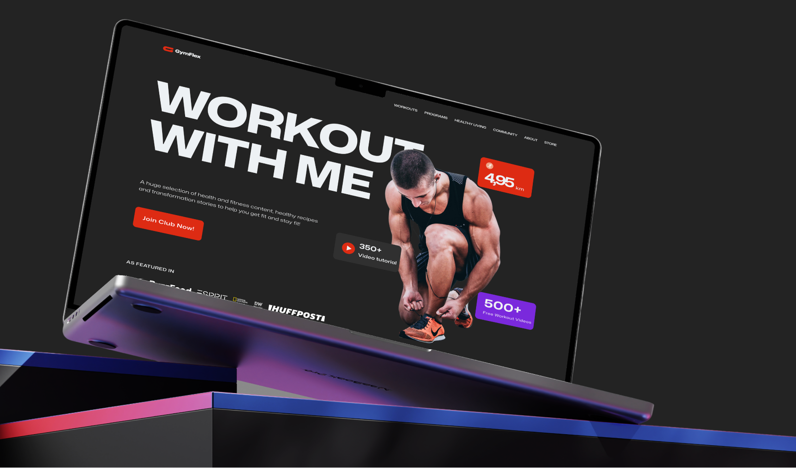
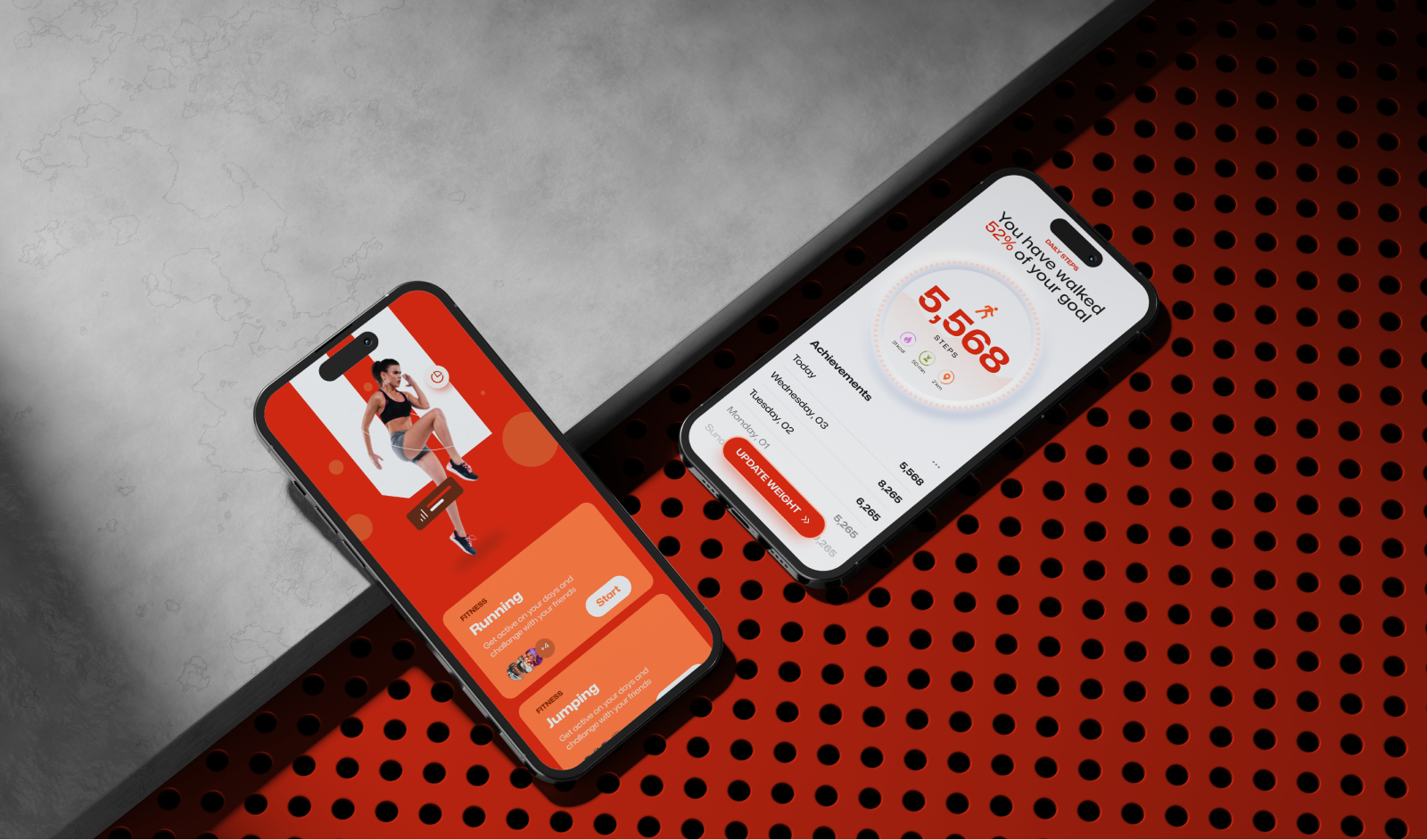
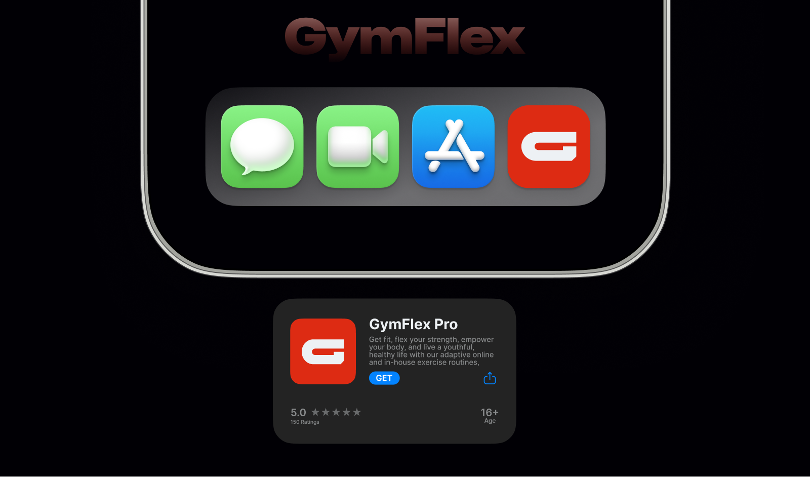
Fitness Applications
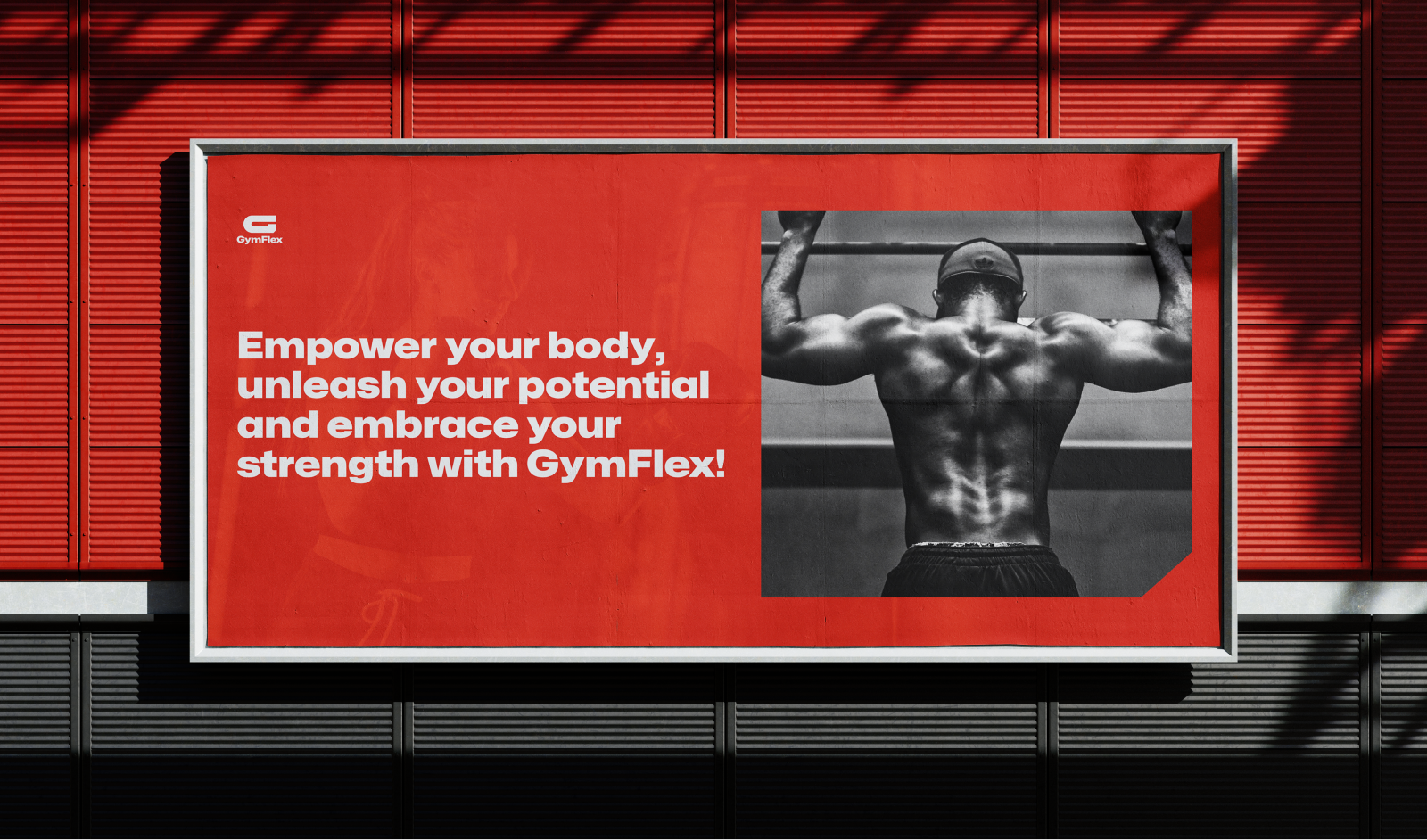
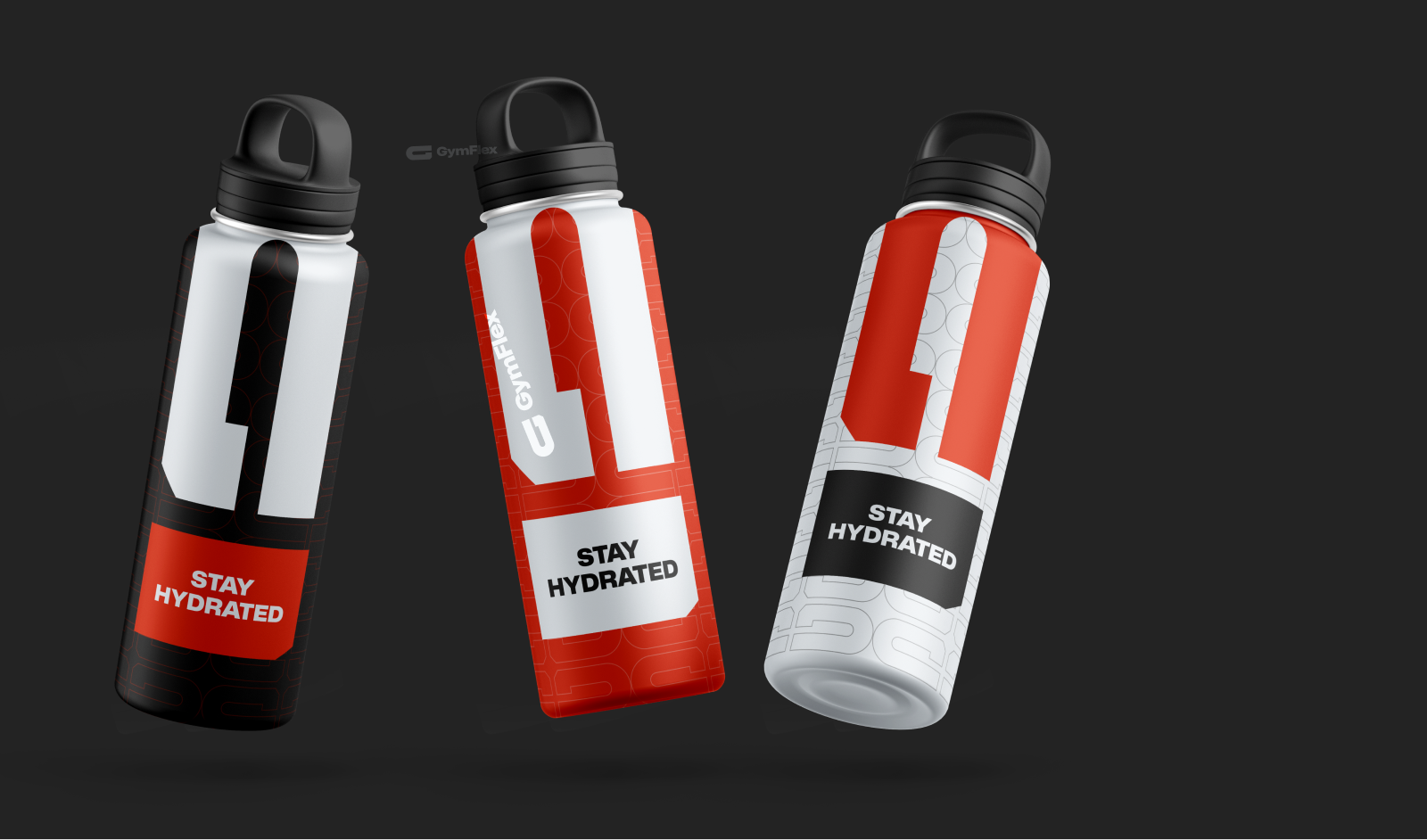
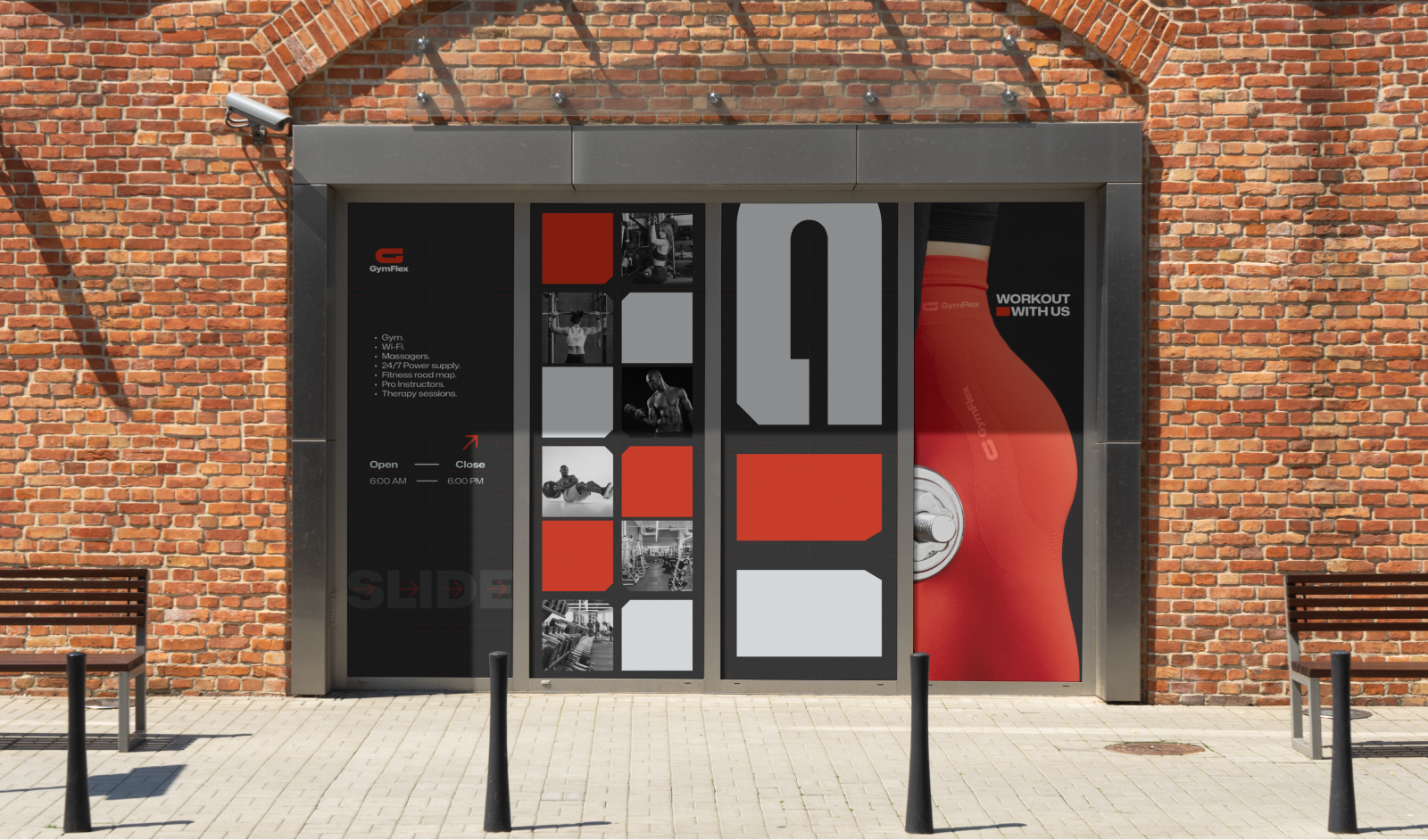
Extended Visual Rollout
// Outcome
Choosing GymFlex means embracing a visual language that resonates with the essence of the fitness journey. The G-shaped geometric logomark becomes an emblem of dedication, transforming the way people perceive and approach wellness. The bold colours infuse vibrancy into the fitness experience, creating a visual synergy between passion and progress.
GymFlex's brand identity ensures that every interaction, from social media posts to marketing materials, is a powerful reminder of the strength within each user waiting to be unleashed. The result is a brand that not only inspires but becomes a seamless part of the fitness narrative, empowering people to flex their potential and redefine their limits. GymFlex is not just a brand; it is a visual echo of fitness triumphs and a symbol of the journey towards a stronger, more flexible self.
Let’s shape a brand system that looks good, works clearly, and moves your business forward.
Whether you need a full identity system, visual strategy, website direction, or design support for an upcoming launch, this is the best next step.