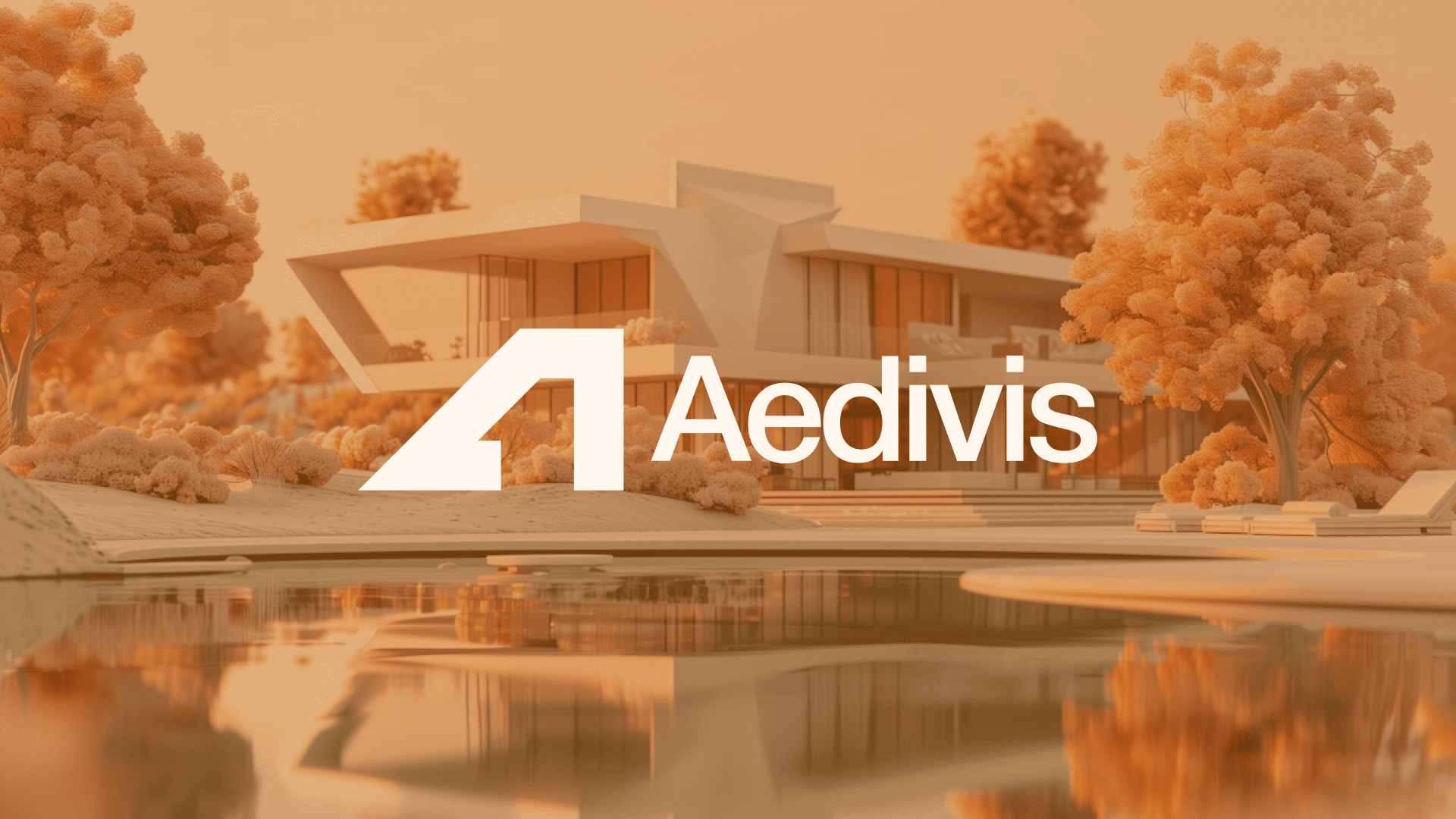
Aedivis
A modern real estate identity system built around openness, warmth, structure, and human connection.
// Challenge
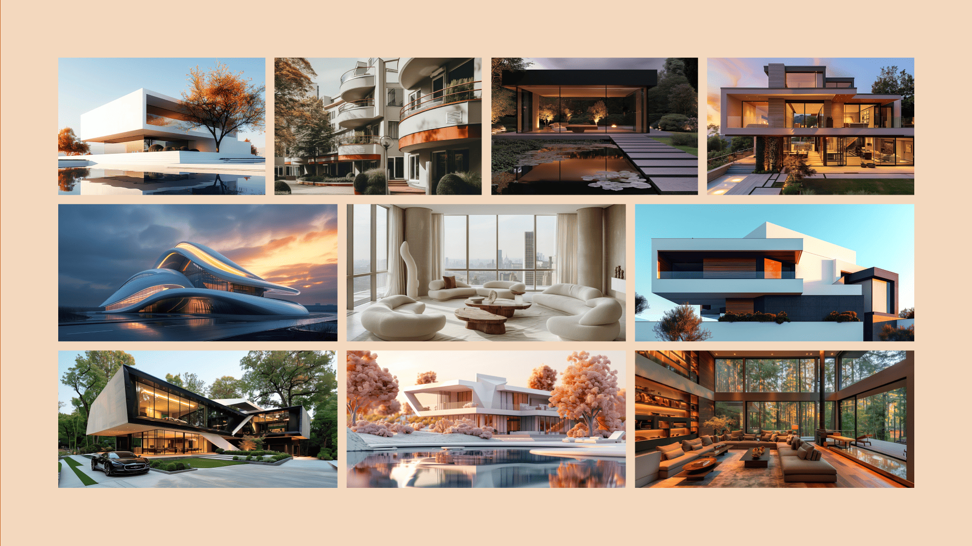
Many spaces today are built with a focus on function alone, often neglecting the human experience within them. This leads to environments that feel cold, disconnected, and uninviting, spaces that people use but do not truly enjoy. In an evolving world where people seek comfort, belonging, and meaningful interactions within their environments, there is a growing need for spaces that seamlessly blend structural excellence with warmth, clarity, and emotional connection. Aedivis exists to solve this by designing and developing well-built and constructed spaces that do more than serve a purpose; they welcome, inspire, and create lasting impressions.
// Strategy
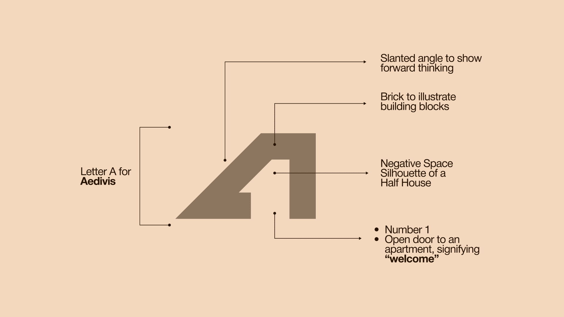
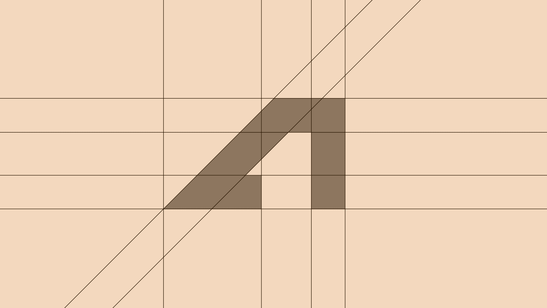
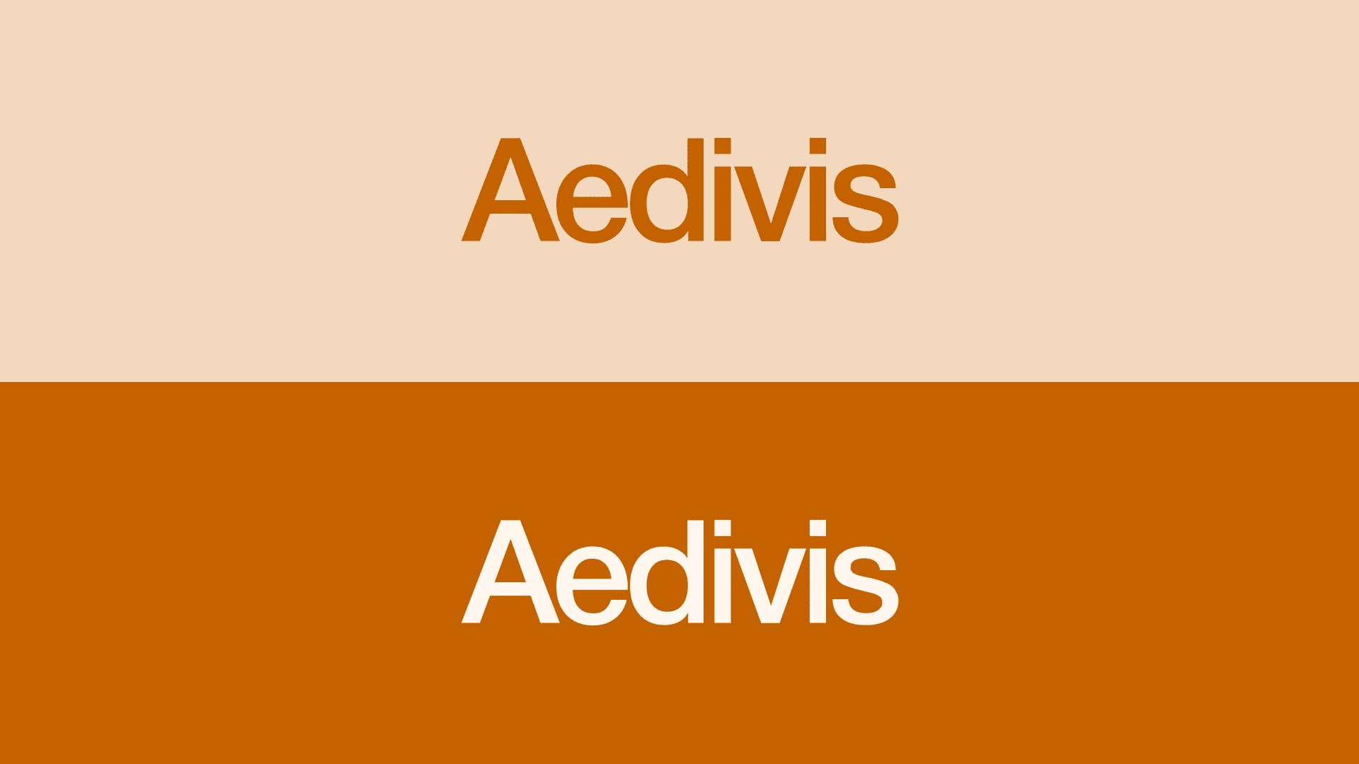
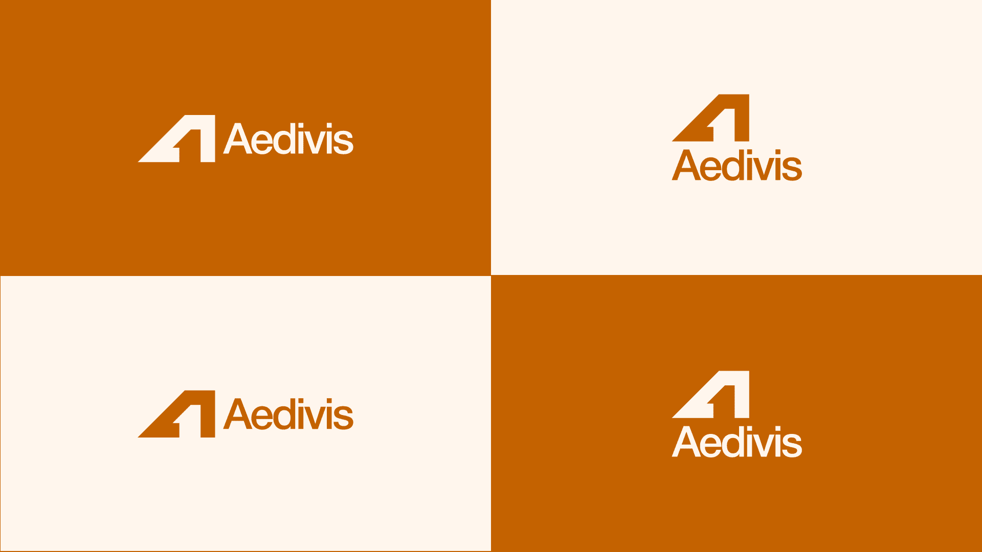
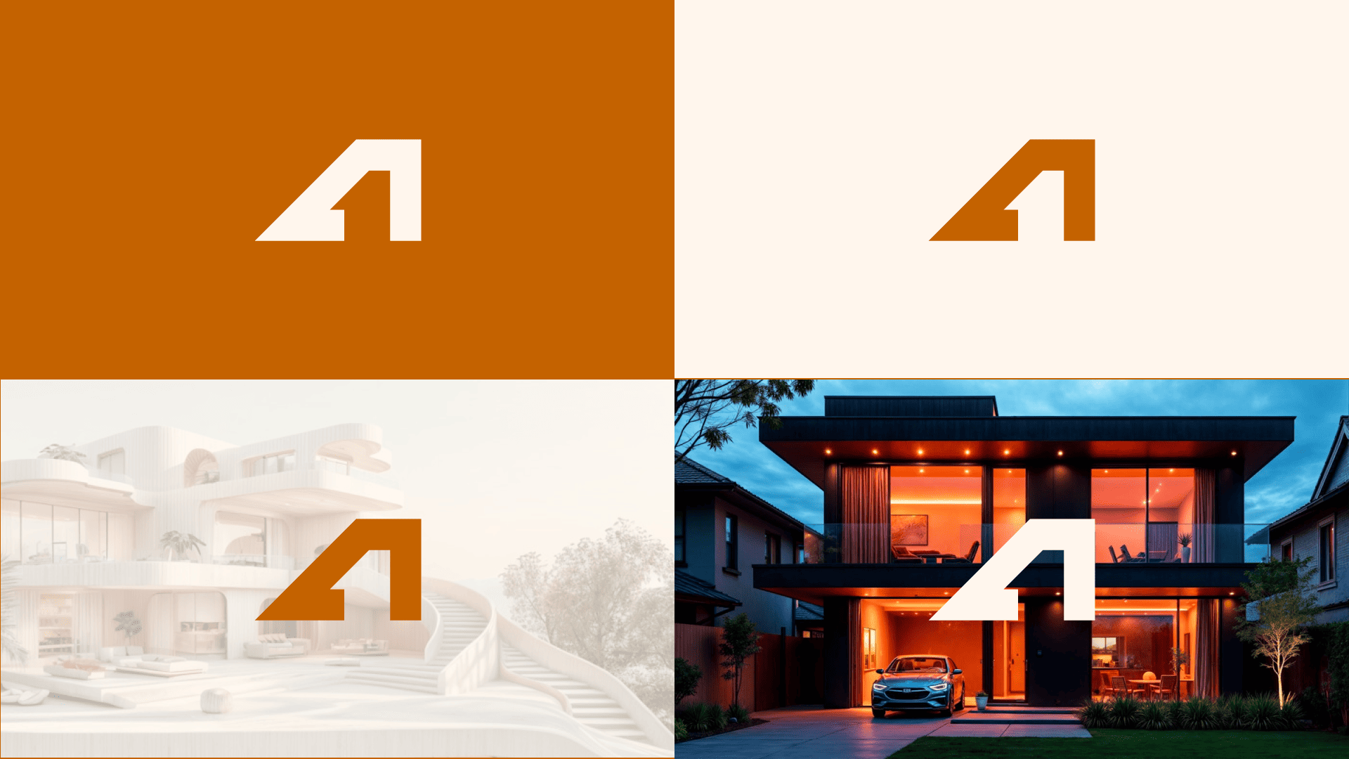
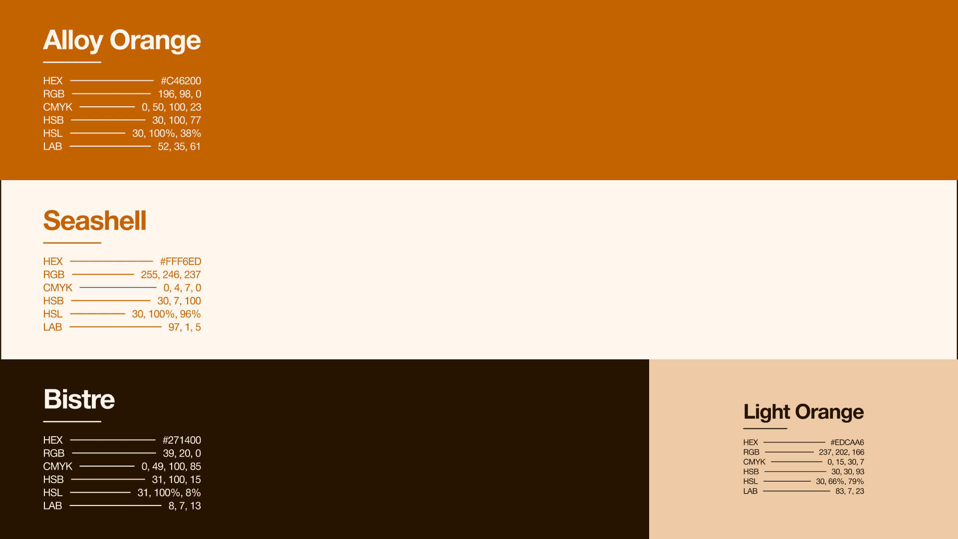
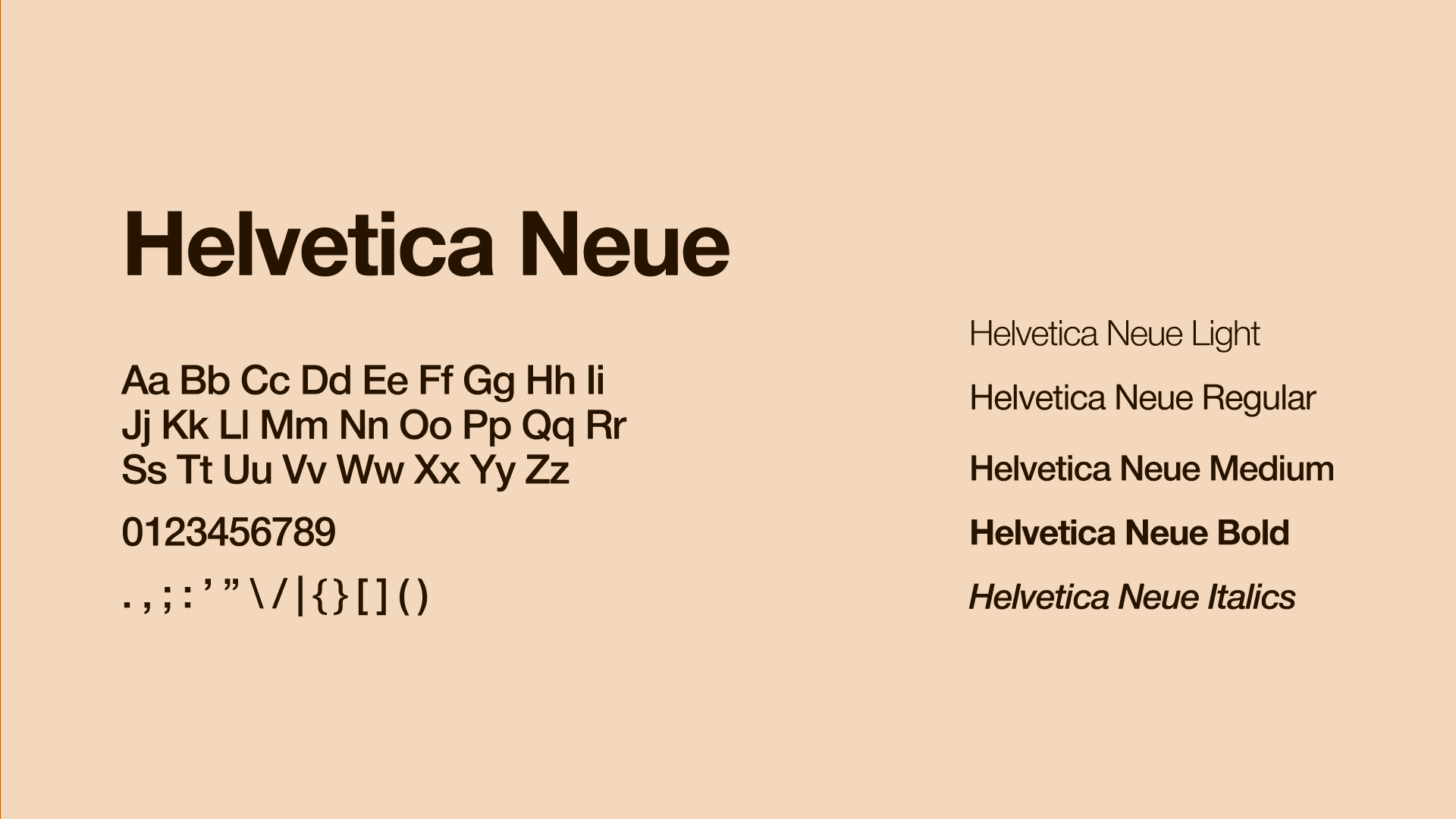
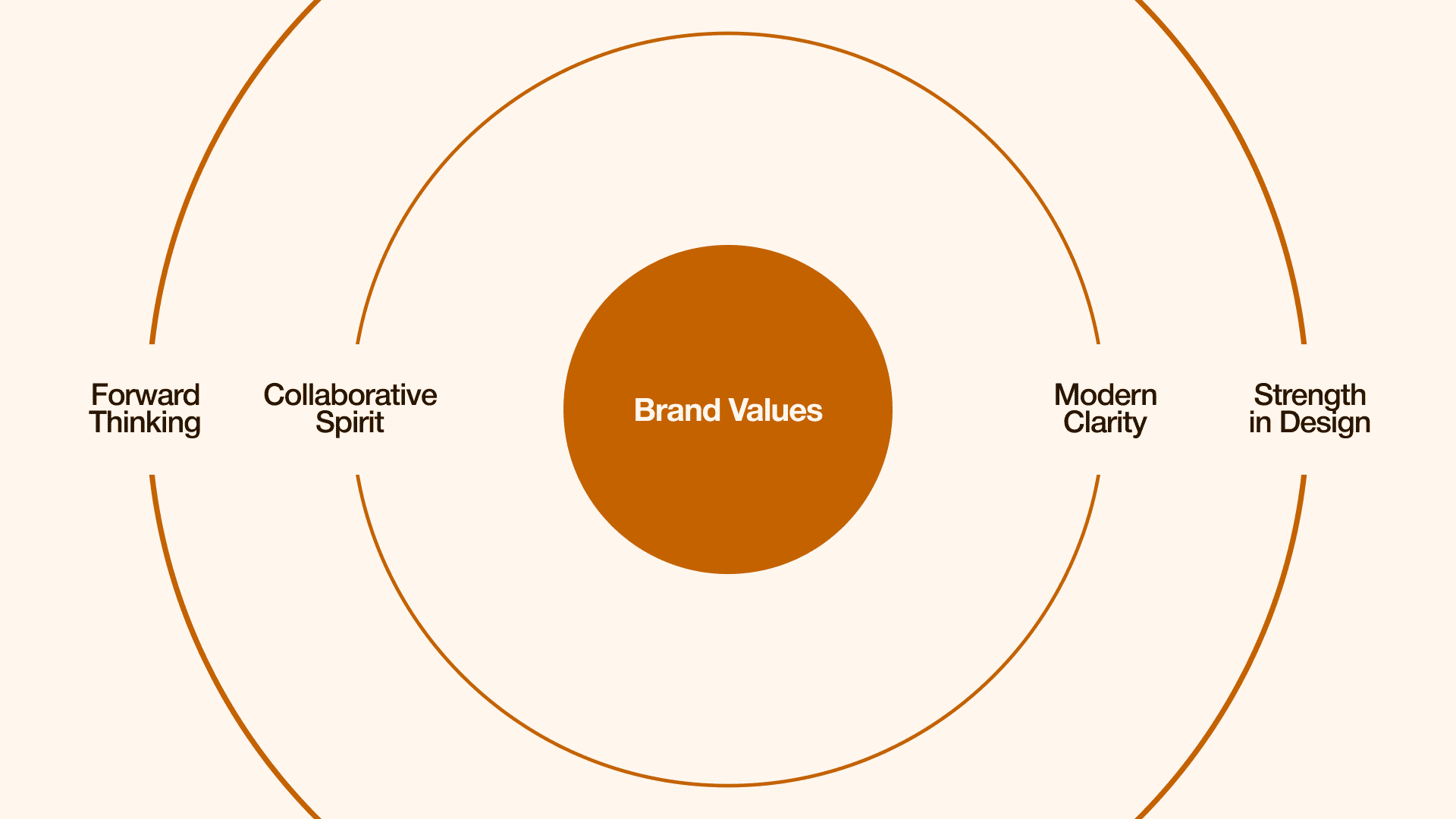
Aedivis delivers thoughtfully created spaces that balance structure, simplicity, storytelling, and human connection. Guided by the concept of an open doorway within its logo, the design environments that invite people in, spaces that feel accessible, warm, and forward-thinking. The visual identity reflects this same approach. The bold yet welcoming Alloy Orange speaks to creativity, optimism, and comfort, while neutral shades like Seashell and Bistre provide calmness, clarity, and grounding, mirroring the design philosophy of combining warmth with stability. Using Helvetica Neue as the sole typeface to maintain clarity, precision, and a modern, timeless tone across all touchpoints. This geometric and neutral typography reflects Aedivis structured, clean, and minimalist design approach, ensuring every message feels intentional, approachable, and refined. Through every detail, from the visual identity to the spaces they create, Aedivis stands for design that is strong, modern, and deeply welcoming.
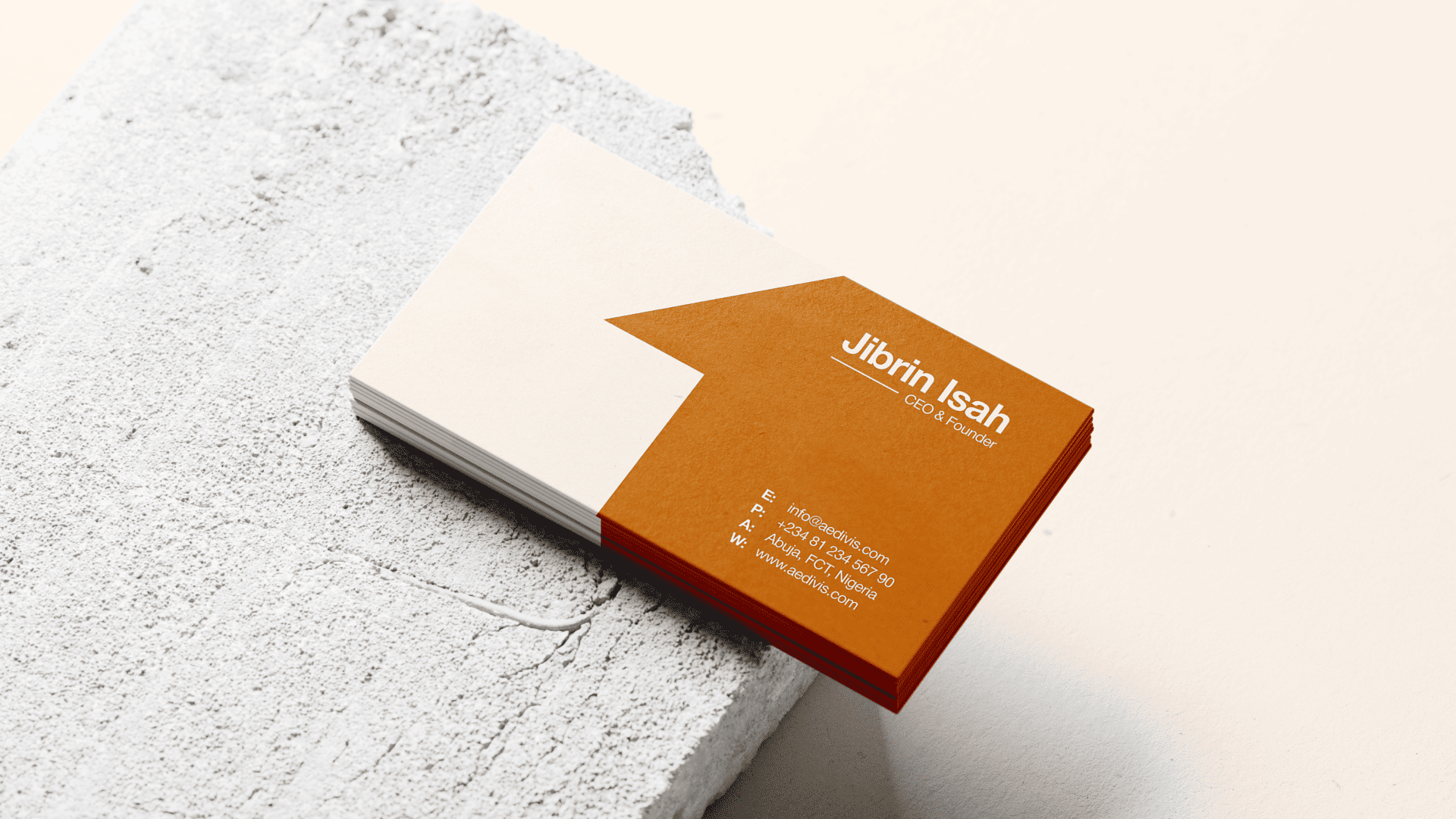
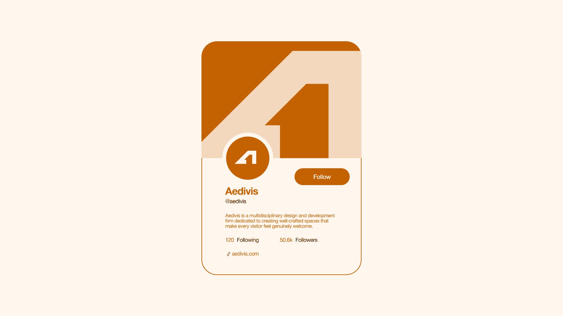
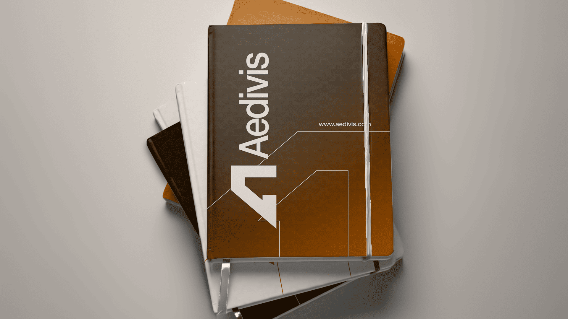
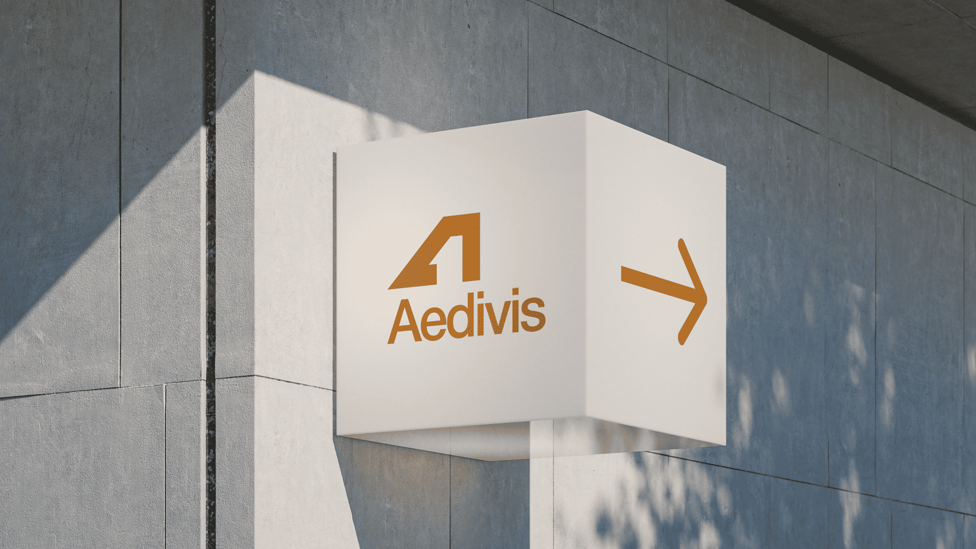
Identity Foundations

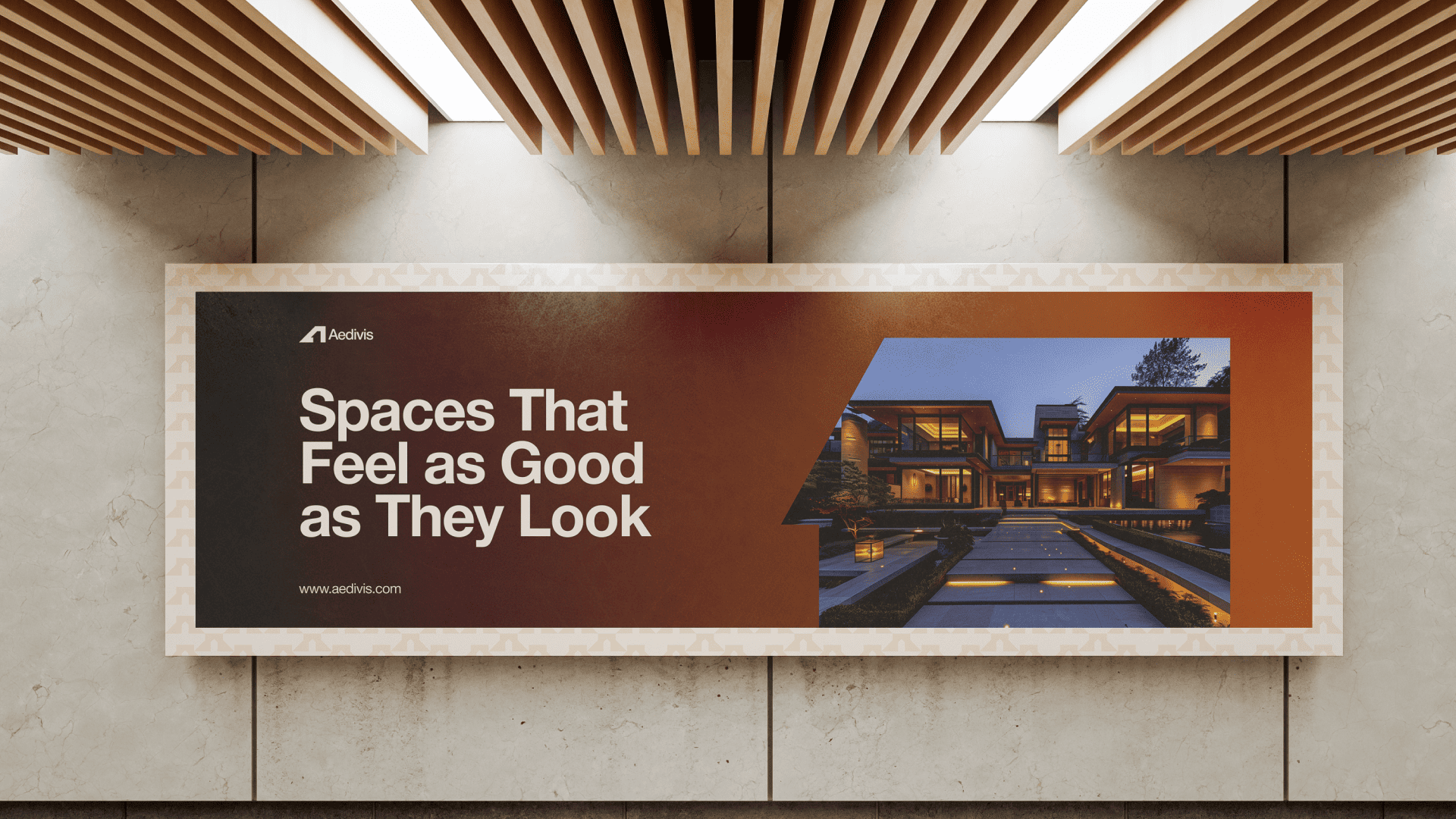
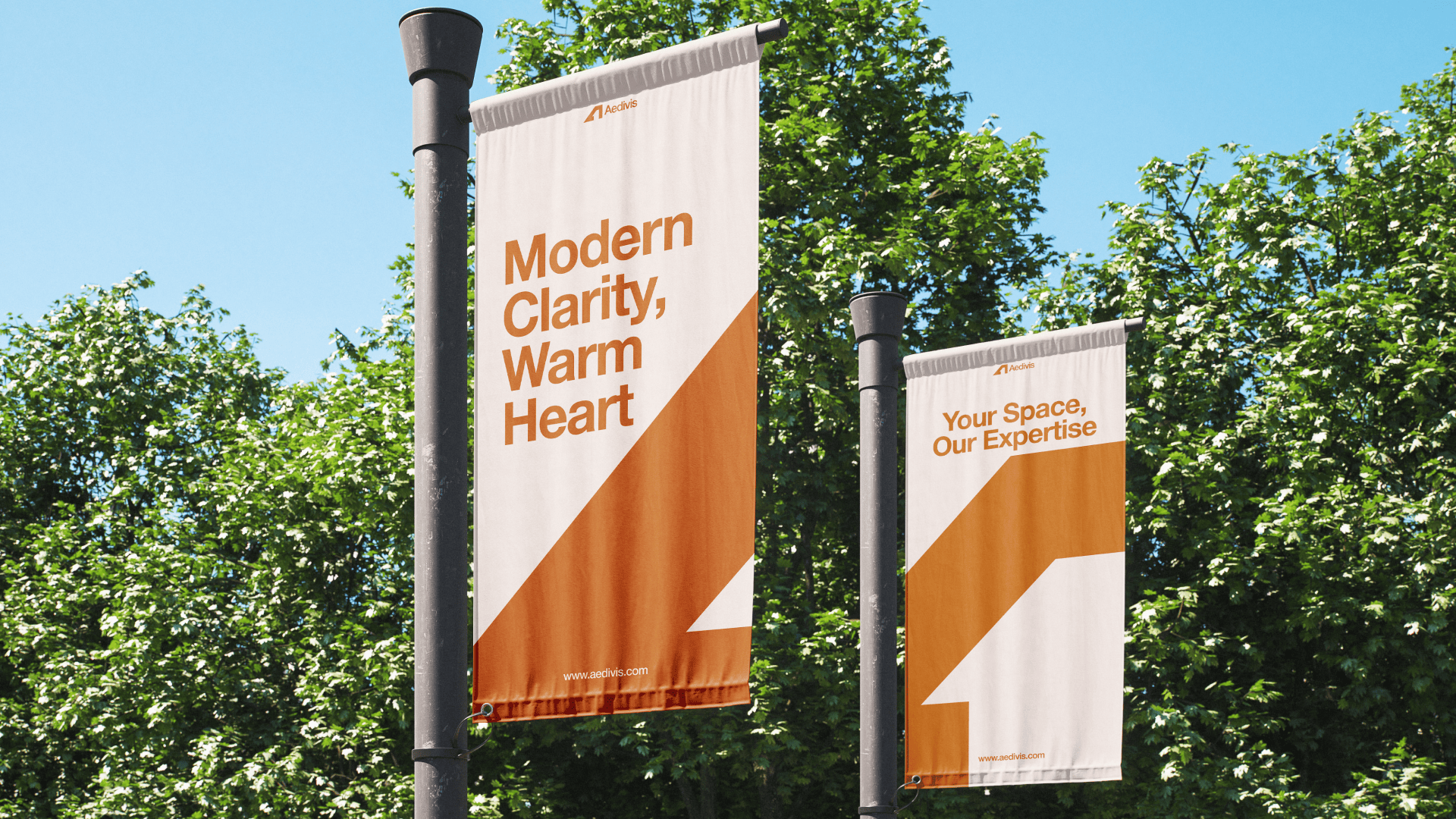
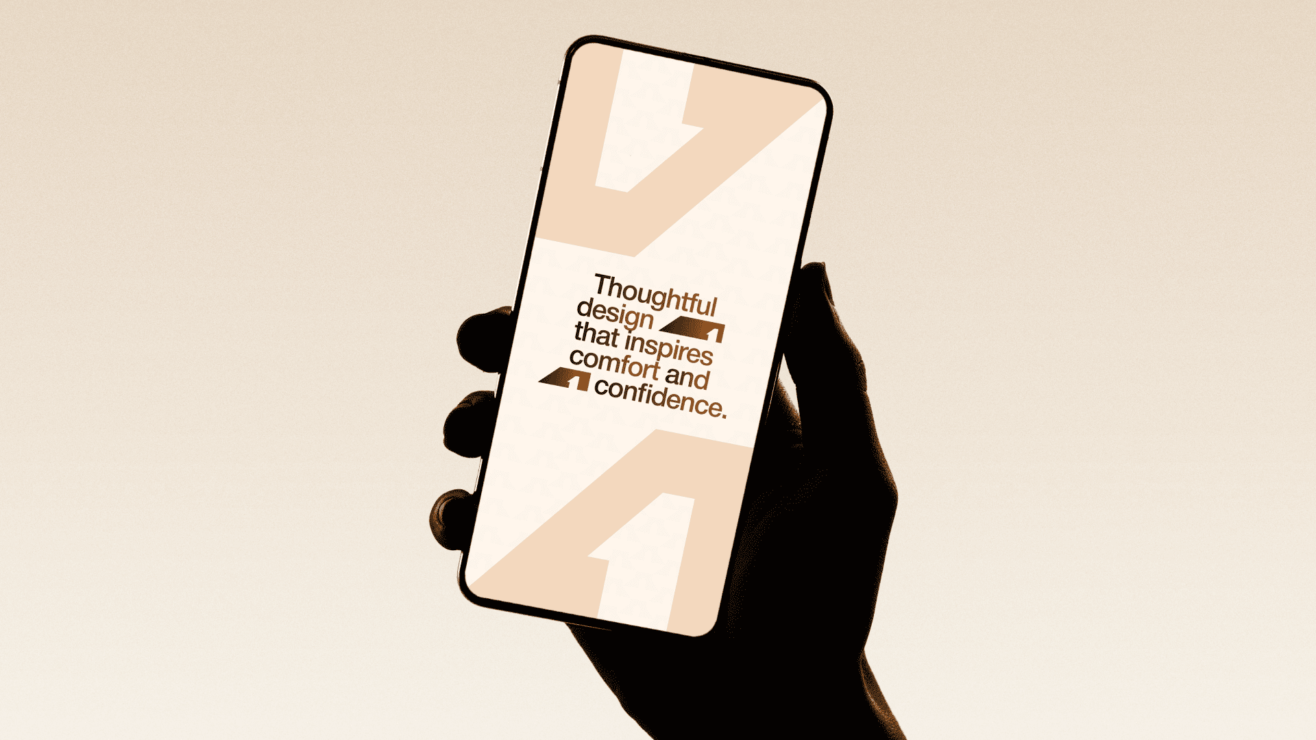
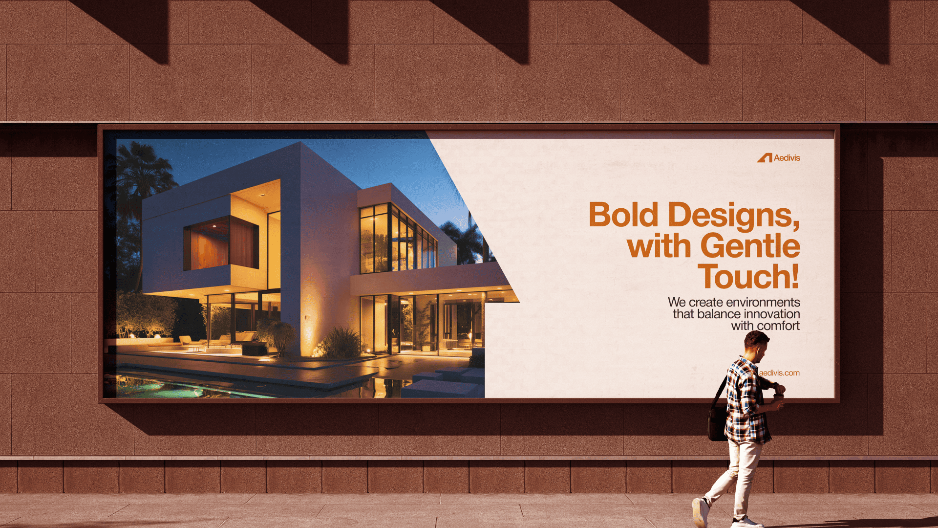
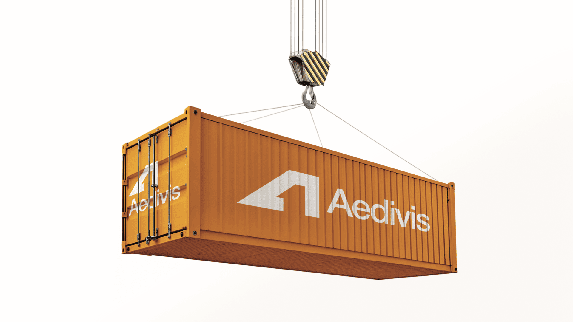
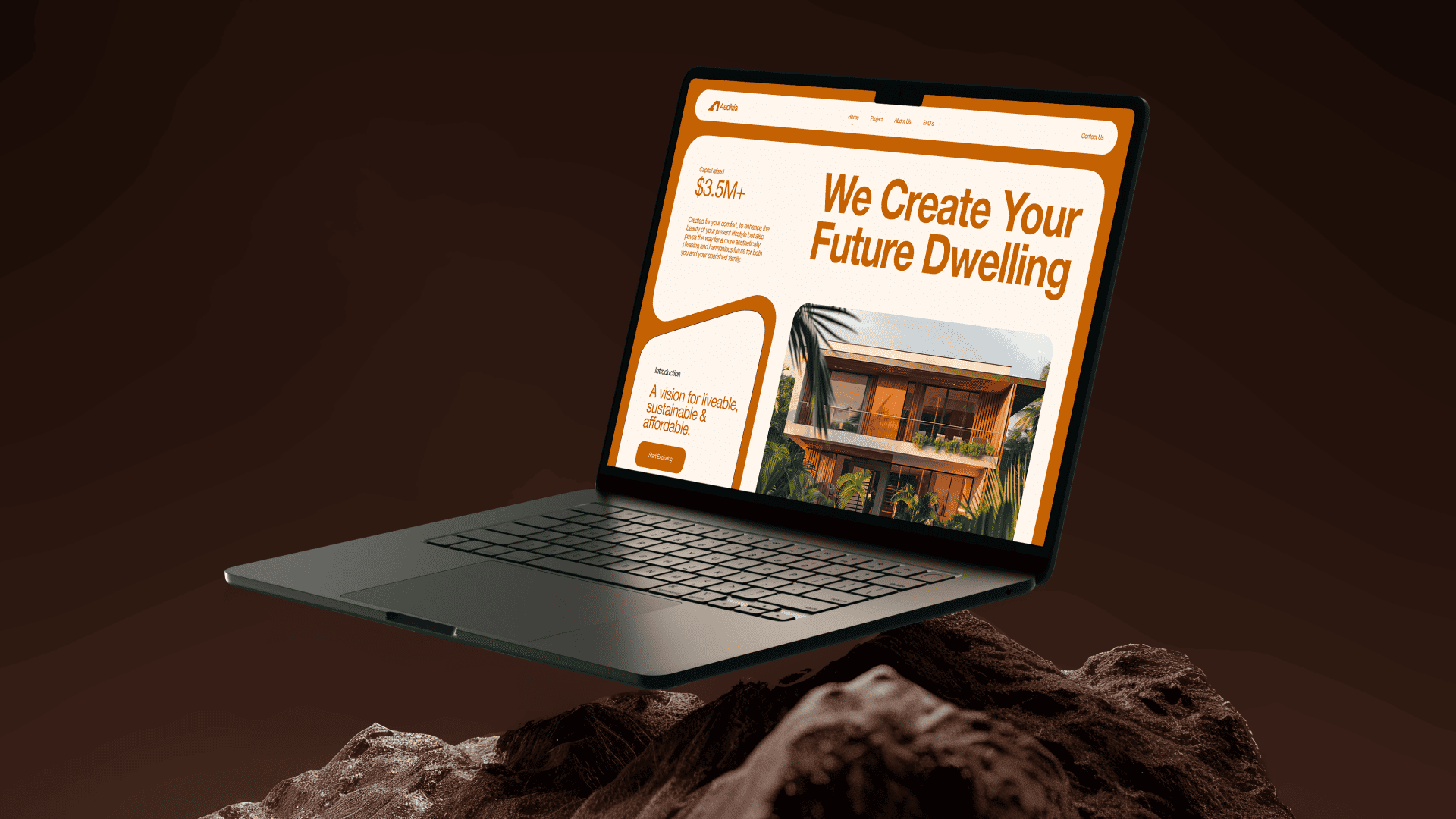
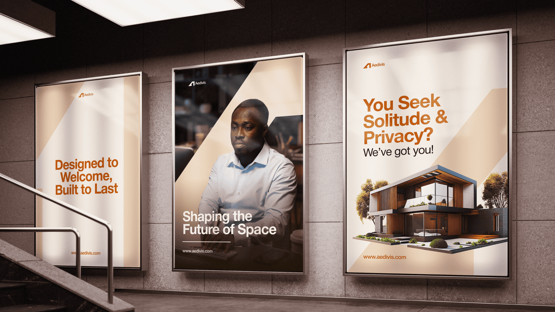
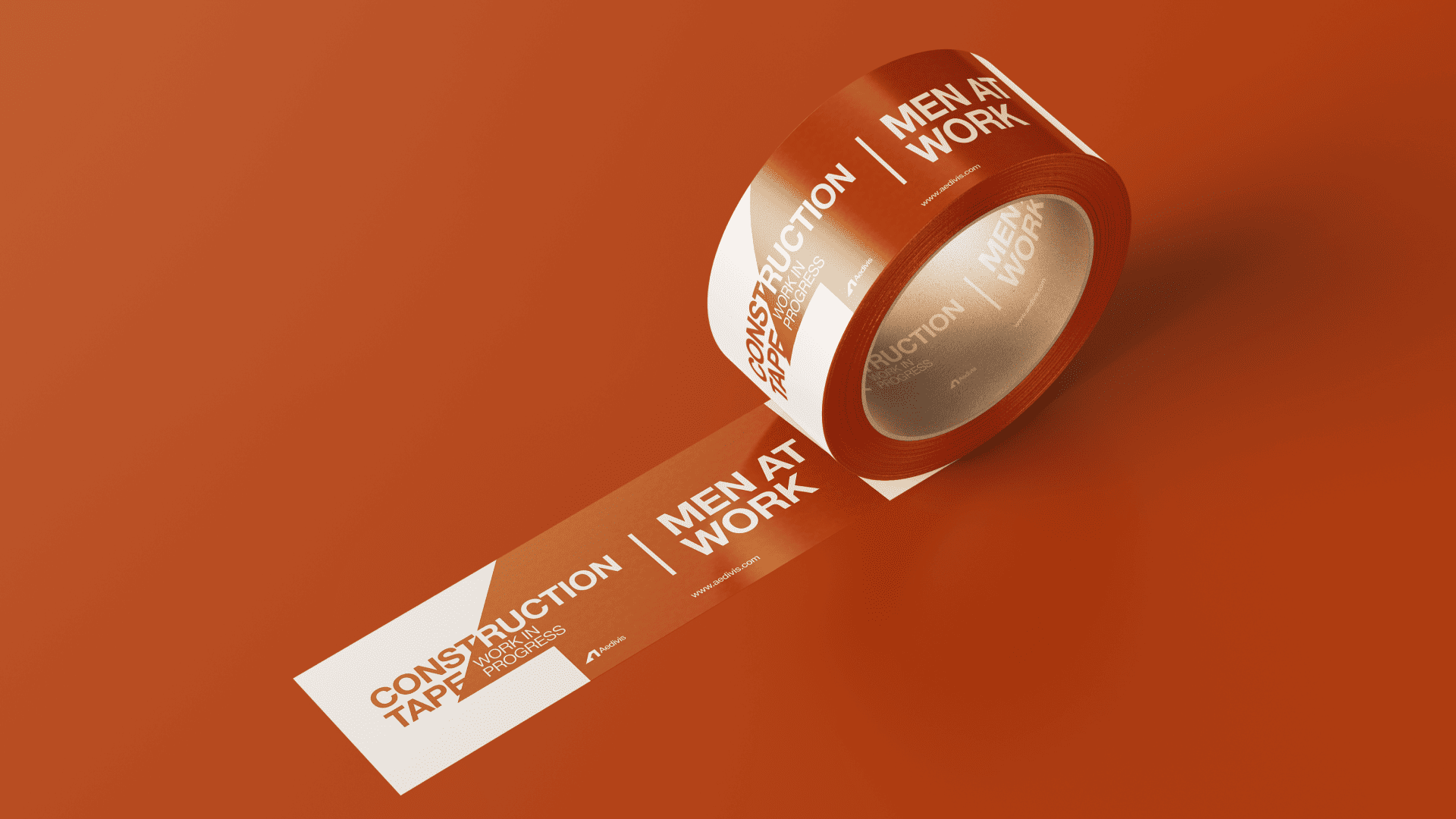
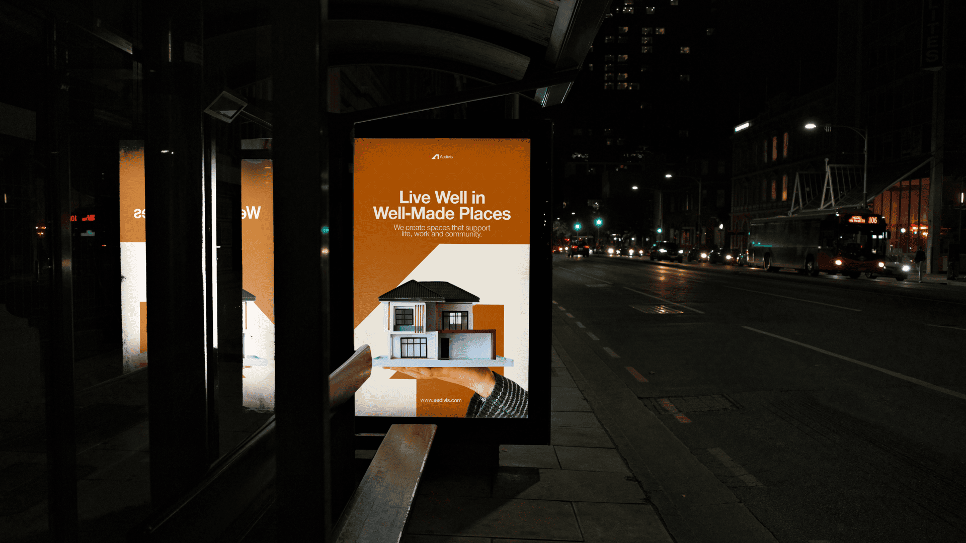
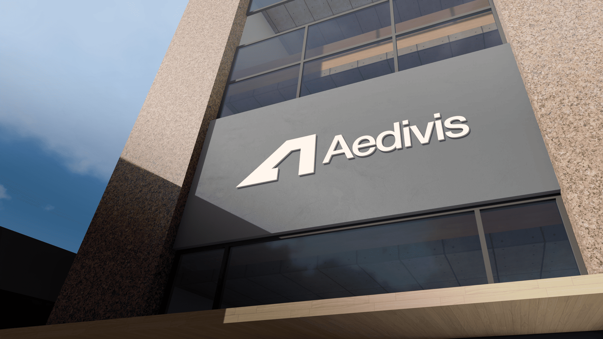
Visual System & Applications
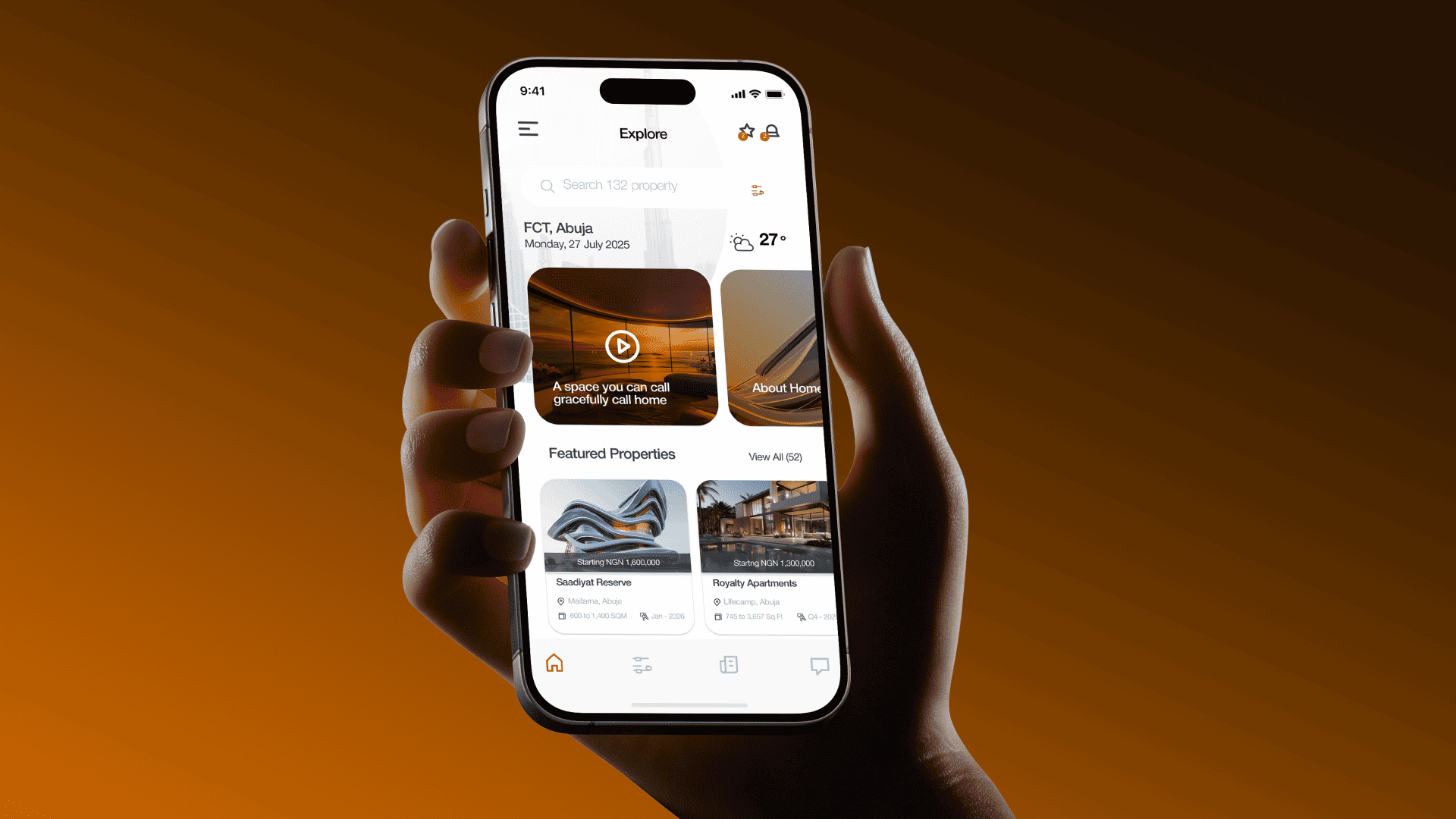
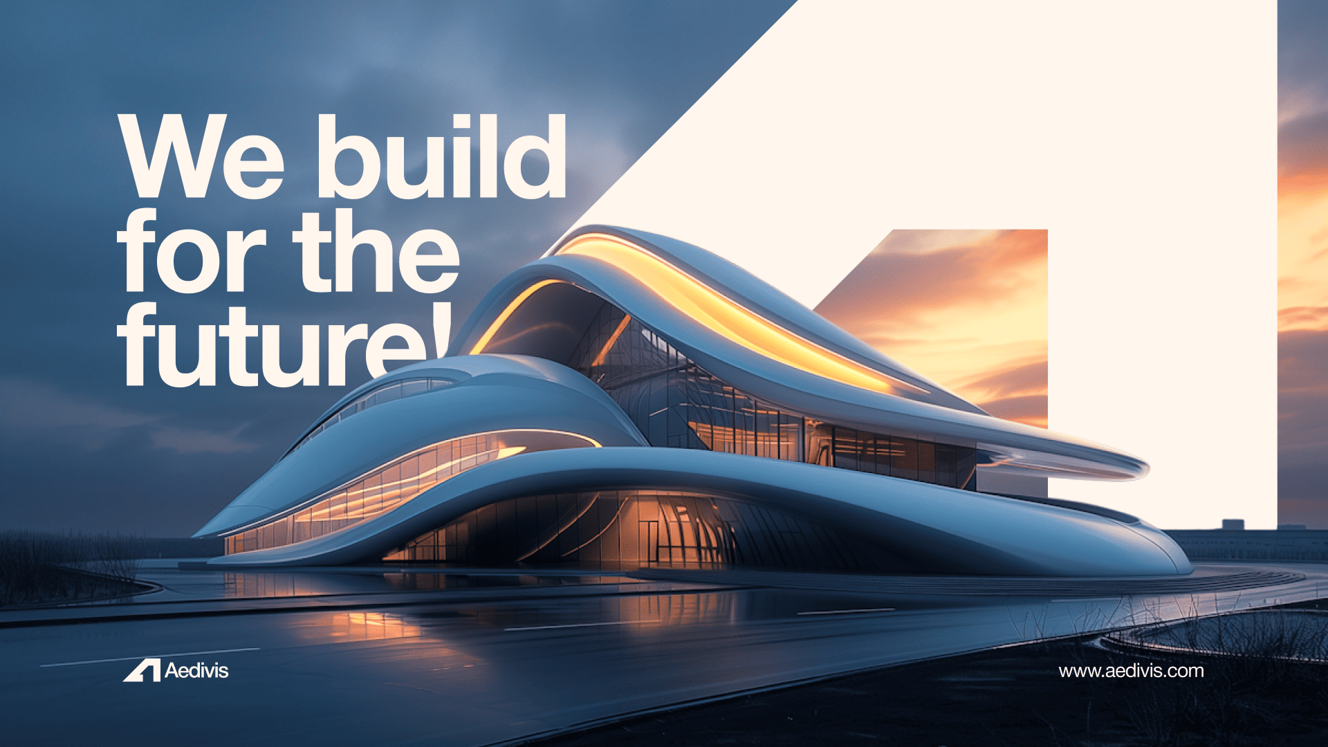
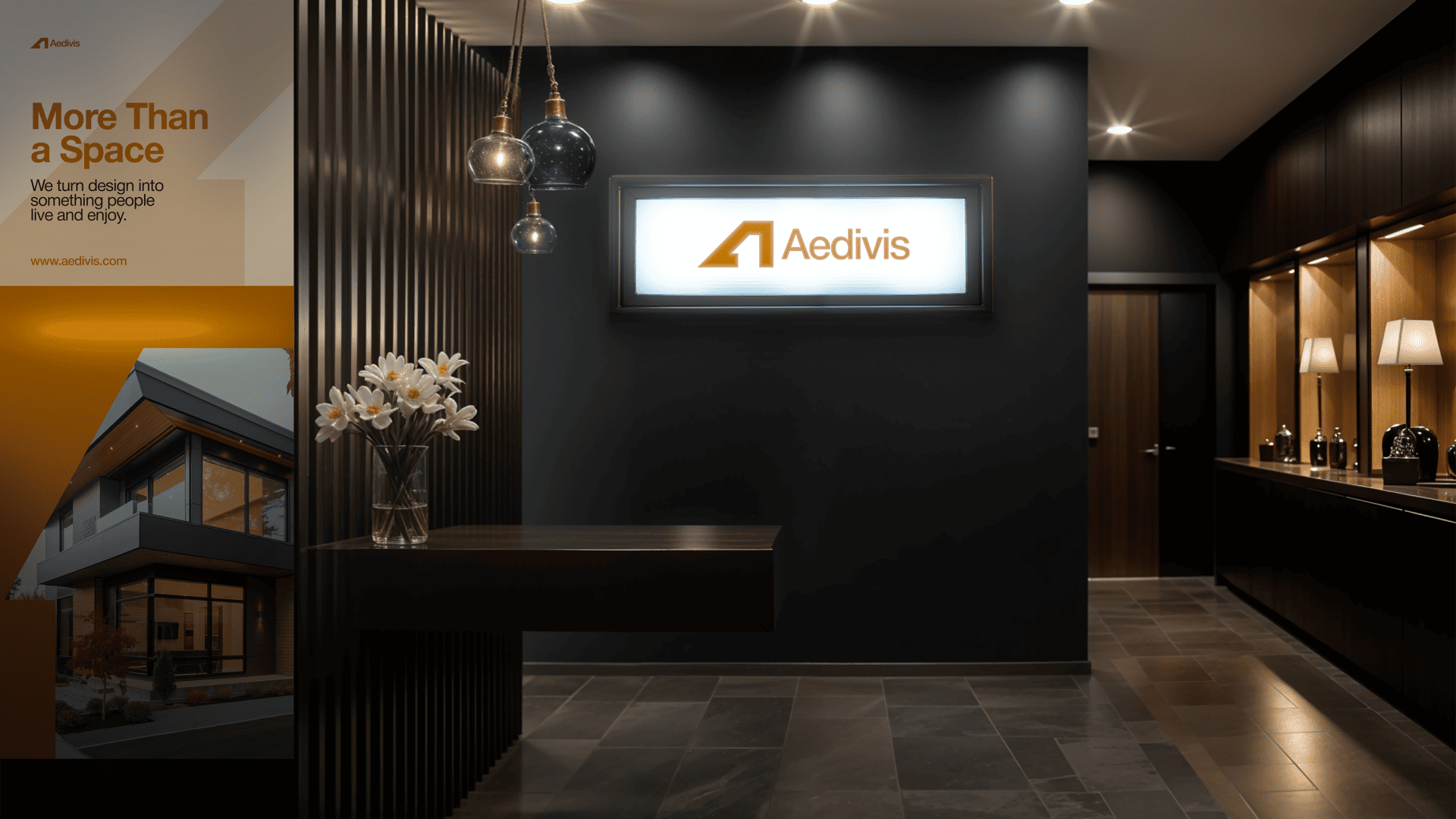
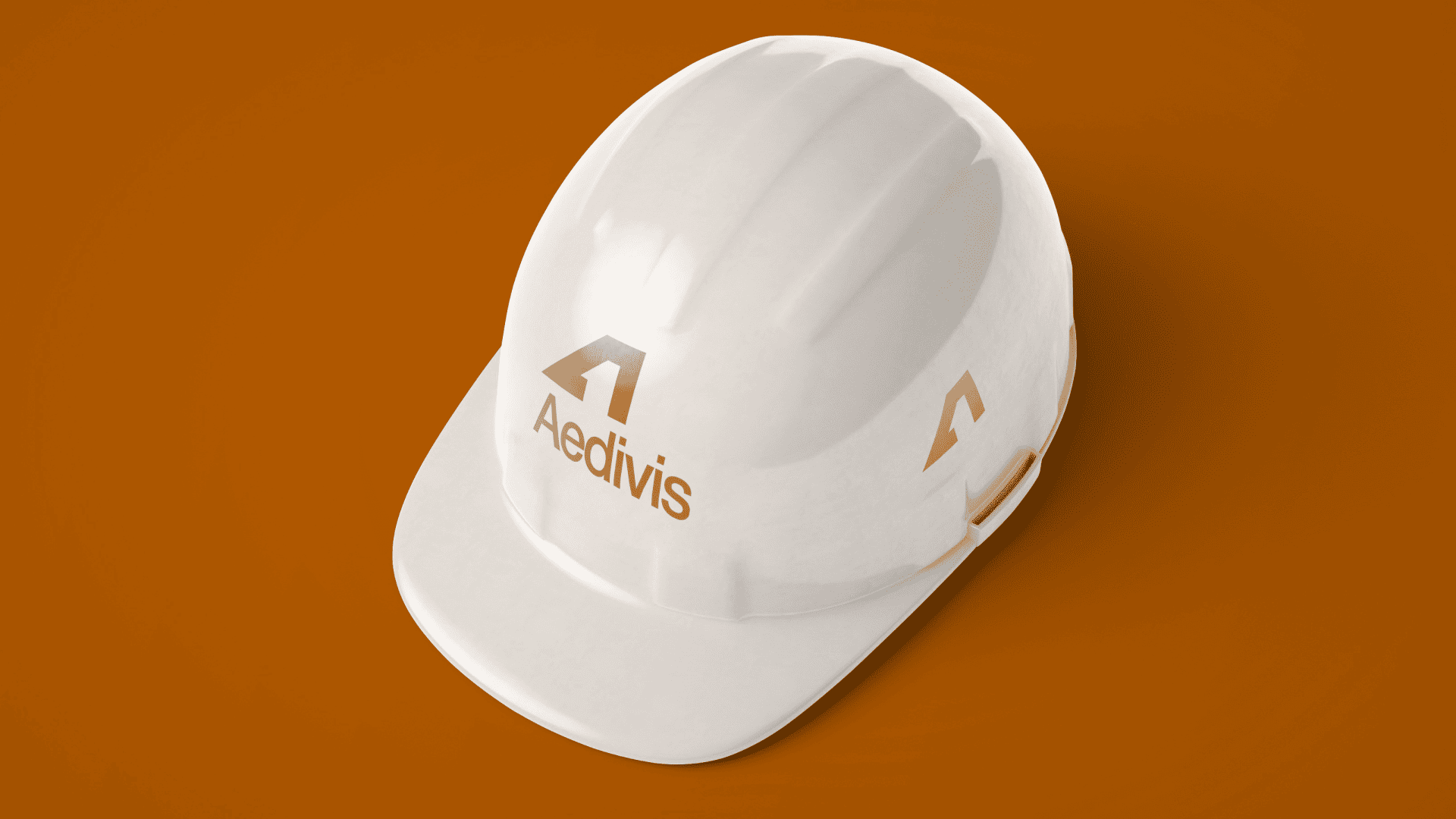
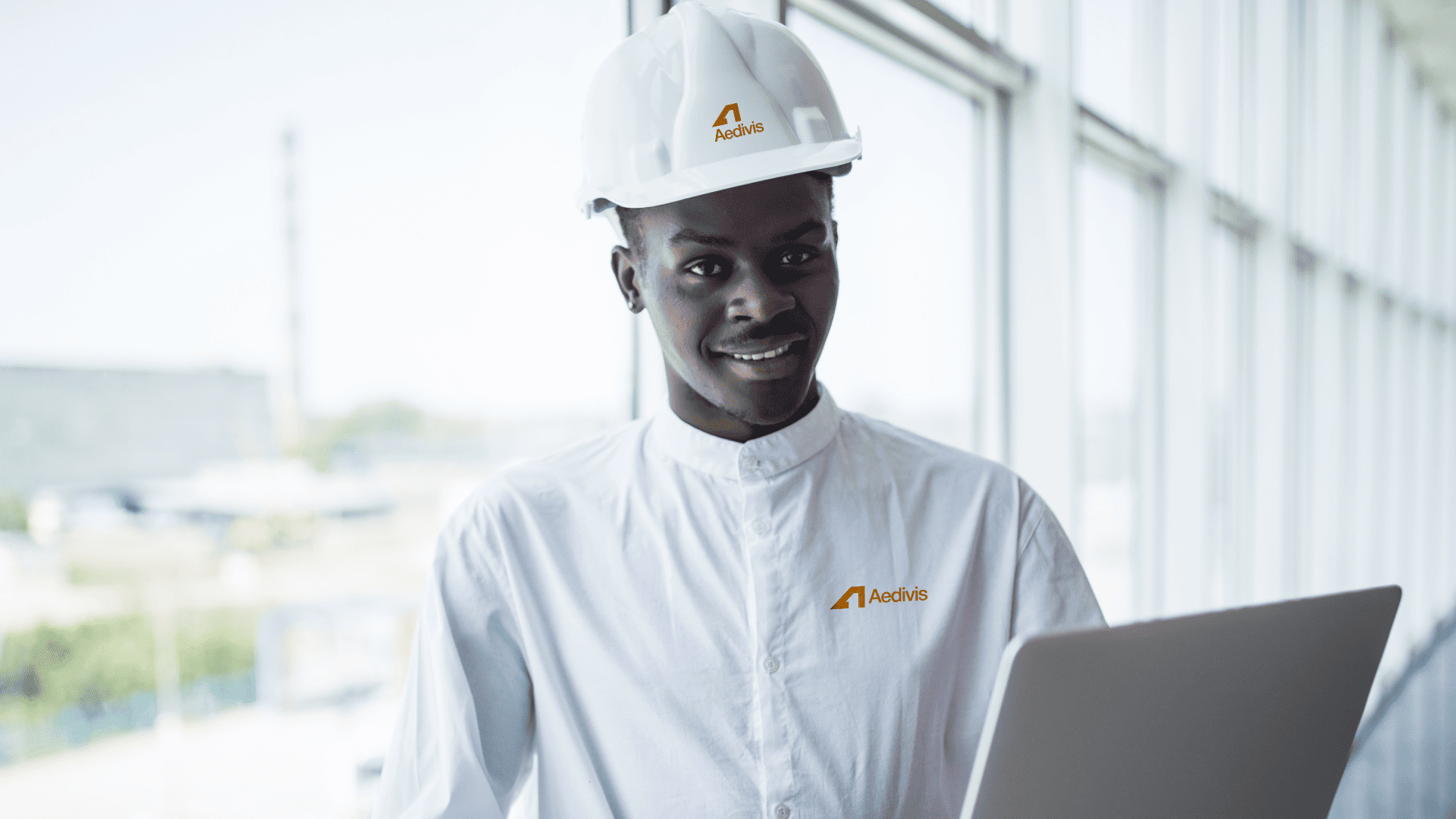
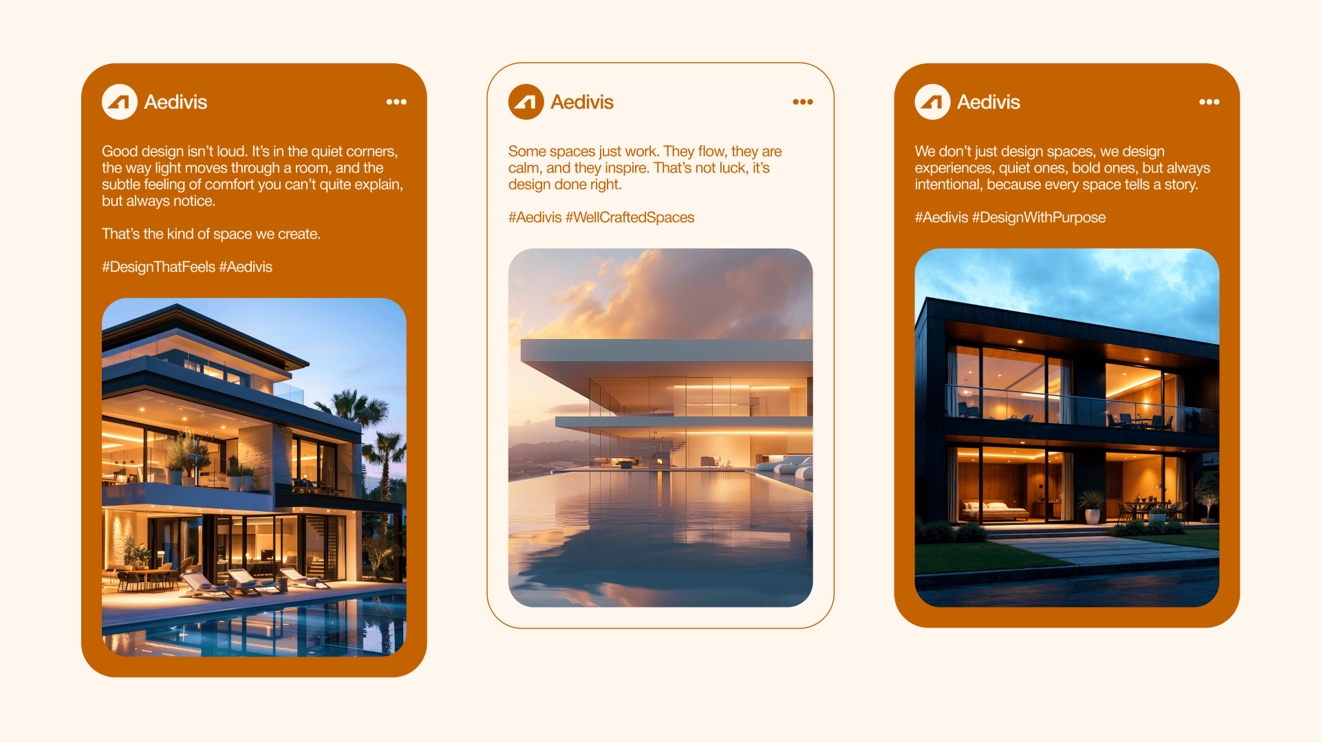
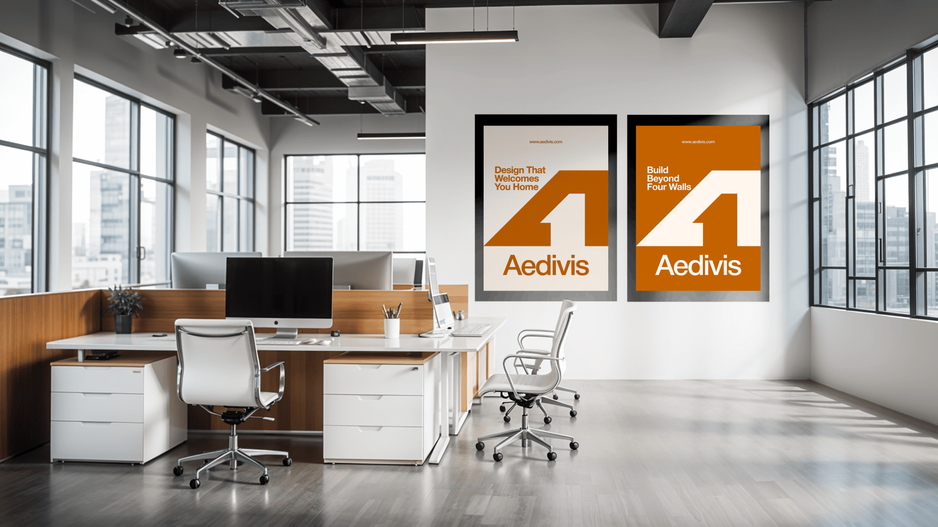
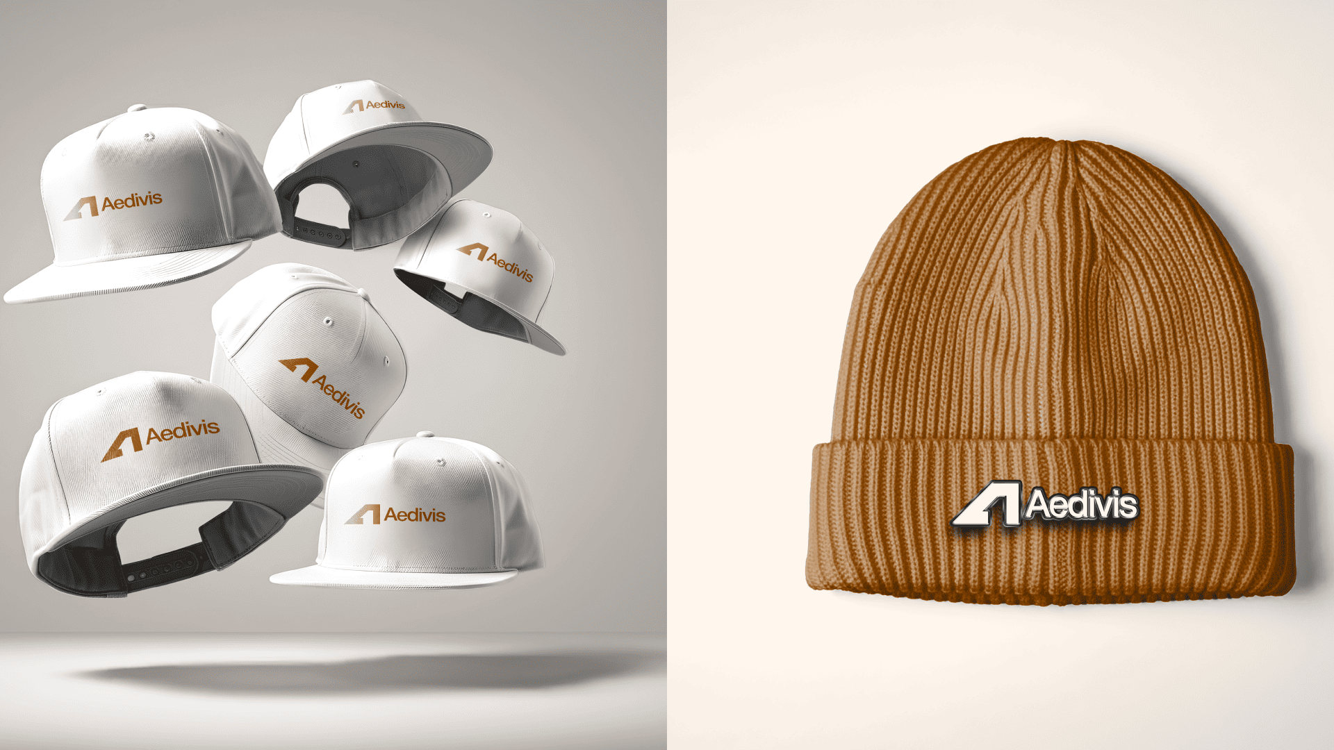
Complete Brand Rollout
// Outcome
With the introduction of its new visual identity, Aedivis has achieved a stronger, more unified brand presence that fully aligns with its core purpose, designing spaces that welcome, inspire, and endure. The refined logo, symbolising openness and structure, now serves as an instantly recognisable mark of trust, professionalism, and forward-thinking design.
The carefully selected colour palette, led by Alloy Orange and complemented by soft neutrals, has infused the brand with warmth and sophistication, evoking comfort, optimism, and lasting quality in every visual expression. Combined with the timeless clarity of Helvetica Neue, Aedivis now communicates with consistency, confidence, and modern simplicity across all platforms. This cohesive identity has elevated Aedivis’s position in the highly competitive real estate and architectural market. It has sharpened brand recognition, strengthened client trust, and reinforced the company’s vision of creating well-crafted spaces that resonate deeply with people. Today, Aedivis stands apart, defined by a visual language that reflects its mission and invites lasting connections in every space it creates.
Let’s shape a brand system that looks good, works clearly, and moves your business forward.
Whether you need a full identity system, visual strategy, website direction, or design support for an upcoming launch, this is the best next step.